Apple-Inspired
corporate Visual styleRefined simplicity inspired by Cupertino
Reference year: 2025
Compare this themeBest for
SaaS, Ecommerce, Portfolio
Less suitable for
- Interfaces that need many controls visible at once.
Live component preview
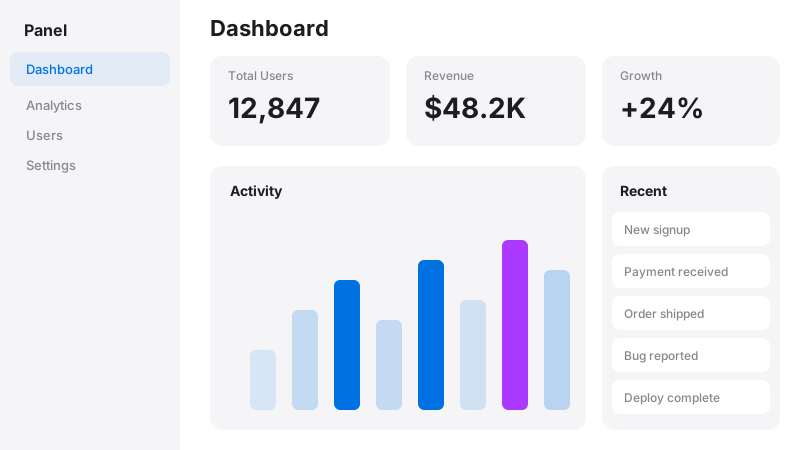
Try the sample controls. daisyUI uses compiled library classes; shadcn/ui uses React components from the New York registry. The three example layouts demonstrate styling with the selected tokens. All content is demo data.
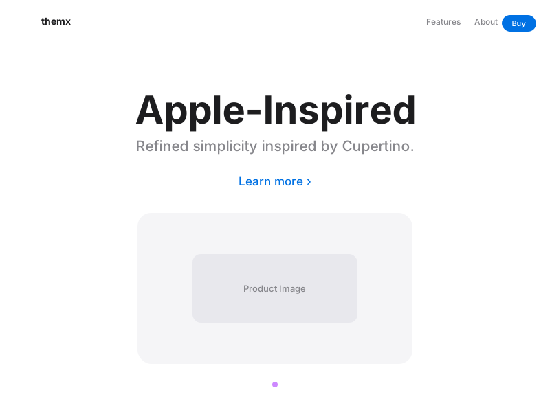
Examples
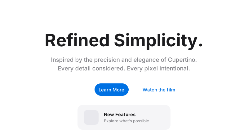
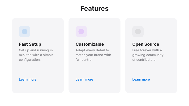
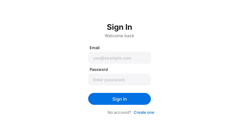
Color Palette
Typography
Key Characteristics
- Heavy use of whitespace and negative space
- Large hero imagery with text overlays
- Subtle animations and transitions
- Rounded rectangles everywhere
- Clean sans-serif typography
- Product-focused minimalism
Tags
Apple’s design language has become one of the most recognized and imitated aesthetics in digital design. Characterized by vast whitespace, precise typography, and an almost obsessive attention to detail, this style communicates premium quality through simplicity. Every Apple product page is a masterclass in letting content breathe, using space itself as a design element, and crafting micro-interactions that feel inevitable rather than novel.
When to Use
Apple-Inspired design is ideal for technology product showcases, premium consumer electronics, SaaS landing pages, and any brand that wants to communicate polish, quality, and attention to detail. It works exceptionally well for single-product landing pages where one hero image needs to carry the visual weight. The style is also effective for company websites and investor-facing pages where professionalism and premium positioning are key objectives.
Key Visual Elements
Whitespace is the dominant visual element — sections breathe with generous padding (often 80-120px vertically). Hero images are large, high-quality, and often product photography on clean backgrounds. The signature rounded rectangle (squircle) appears everywhere — in buttons, cards, app icons, and image containers. Colors are restrained: a single blue for CTAs, grays for secondary text, and near-black for primary text. Animations are subtle but precise — elements fade in on scroll, hover states transition smoothly, and nothing moves without purpose.
Typography
SF Pro Display and SF Pro Text (or their web-safe approximations like Inter or -apple-system) define the typographic identity. Display weights are used for large hero headlines in light or regular weight — never bold, which would feel heavy-handed. Text optical size is used for body copy, optimized for readability at smaller sizes. The type scale is dramatic: hero text might be 56-96px while body text sits at 17-19px. Line heights are carefully tuned per size.
Export style
Choose a library mapping or use the CSS variables in your own components. JSON includes the same mapping. Load the listed fonts separately.
:root {
  --tx-surface-bg: #FFFFFF;
  --tx-font-heading: "SF Pro Display", sans-serif;
  --tx-font-body: "SF Pro Text", sans-serif;
  --tx-surface-bg-image: none;
  --tx-card-bg: #FFFFFF;
  --tx-card-border: rgba(0,0,0,0.06);
  --tx-card-border-width: 1px;
  --tx-card-radius: 1.25rem;
  --tx-card-shadow: 0 2px 12px rgba(0,0,0,0.06);
  --tx-card-backdrop-blur: 0px;
  --tx-card-border-hover: rgba(0,113,227,0.2);
  --tx-card-shadow-hover: 0 4px 20px rgba(0,0,0,0.08);
  --tx-font-heading-weight: 600;
  --tx-font-body-weight: 400;
  --tx-text-muted: rgba(29,29,31,0.6);
  --tx-text-subtle: rgba(29,29,31,0.4);
  --tx-link-color: #0071E3;
  --tx-button-radius: 9999px;
  --tx-input-bg: #FFFFFF;
  --tx-input-border: rgba(0,0,0,0.1);
  --tx-text: #1D1D1F;
  --tx-primary: #0071E3;
  --tx-secondary: #86868B;
  --tx-accent: #AC39FF;
  --tx-media-filter: none;
}
Prompt Builder
Choose your project, UI library, and output. Prompts, documents, and exports use the same resolved theme values.
Use your own components with the exported CSS variables.
Apple-Inspired
Live component preview
Try the sample controls. daisyUI uses compiled library classes; shadcn/ui uses React components from the New York registry. The three example layouts demonstrate styling with the selected tokens. All content is demo data.
Copy this prompt into your coding assistant. The task mode applies to the UI prompt.
Generated prompt
You are building a web application using Next.js with Tailwind.
Read existing project instructions and reuse installed components where available.

## Project
Project brief: Not specified
Target users: Not specified
Page purpose: SaaS
Framework: Next.js
CSS approach: Tailwind
UI library: Custom / no library
Tone: Professional

## Visual direction
Base theme: Apple-Inspired (visual-style)
- Heavy use of whitespace and negative space
- Large hero imagery with text overlays
- Subtle animations and transitions
- Rounded rectangles everywhere
- Clean sans-serif typography
- Product-focused minimalism

## Resolved style
Use this final token set. It already includes the selected layers. These values take precedence over conflicting base characteristics.
Color palette: primary #0071E3, secondary #86868B, accent #AC39FF, background #FFFFFF, text #1D1D1F
Typography: SF Pro Display for headings, SF Pro Text for body text
Load the declared fonts with the required weights. Use system fallbacks when a font is unavailable.
```css
:root {
  --tx-surface-bg: #FFFFFF;
  --tx-font-heading: "SF Pro Display", sans-serif;
  --tx-font-body: "SF Pro Text", sans-serif;
  --tx-surface-bg-image: none;
  --tx-card-bg: #FFFFFF;
  --tx-card-border: rgba(0,0,0,0.06);
  --tx-card-border-width: 1px;
  --tx-card-radius: 1.25rem;
  --tx-card-shadow: 0 2px 12px rgba(0,0,0,0.06);
  --tx-card-backdrop-blur: 0px;
  --tx-card-border-hover: rgba(0,113,227,0.2);
  --tx-card-shadow-hover: 0 4px 20px rgba(0,0,0,0.08);
  --tx-font-heading-weight: 600;
  --tx-font-body-weight: 400;
  --tx-text-muted: rgba(29,29,31,0.6);
  --tx-text-subtle: rgba(29,29,31,0.4);
  --tx-link-color: #0071E3;
  --tx-button-radius: 9999px;
  --tx-input-bg: #FFFFFF;
  --tx-input-border: rgba(0,0,0,0.1);
  --tx-text: #1D1D1F;
  --tx-primary: #0071E3;
  --tx-secondary: #86868B;
  --tx-accent: #AC39FF;
  --tx-media-filter: none;
}
```
Use the CSS variables in your own components. Apply the heading and body font variables to their respective elements.

## Layout
- Use generous spacing, large product headings, and clearly separated sections.

## Interaction
- Use short opacity and position transitions without delaying navigation.

## Suitability notes
Use these limitations to assess the chosen page purpose. Explain any mismatch before applying an unsuitable treatment.
- Apple-Inspired: Interfaces that need many controls visible at once.

## Components
Generate the following components in this style:
- Hero
- Navbar
- Cards
- Footer

## Quality requirements
Choose section order and visual emphasis from the real content and page purpose. Add only sections needed for the task.
Use supplied content. Label sample data. Do not invent testimonials, customer logos, statistics, or compliance claims.
Every interactive control must perform its declared action or be clearly labeled as a demo.
Include loading, empty, error, success, disabled, and focus states where applicable.
Use semantic HTML, visible keyboard focus, readable text contrast, and labeled form fields.
Ensure responsive design (mobile-first). Preserve reading order and avoid horizontal page overflow.
Respect prefers-reduced-motion. Keep essential content visible when animations are disabled.

## Verification
Check representative desktop and mobile widths, keyboard interaction, and relevant component states. Run available project checks and report what was actually verified.
Use Tailwind utility classes with the declared tokens.
Product context is incomplete. Label assumptions and treat the result as a draft until the missing context is supplied.