Claymorphism
playful Visual effectSoft squishy and delightfully tactile
Reference year: 2024
Compare this themeBest for
Education, Games & entertainment, Brand & events
Less suitable for
- Dense professional interfaces where large rounded elements waste space.
Live component preview
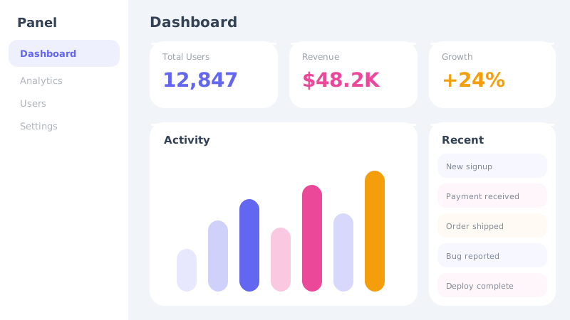
Try the sample controls. daisyUI uses compiled library classes; shadcn/ui uses React components from the New York registry. The three example layouts demonstrate styling with the selected tokens. All content is demo data.
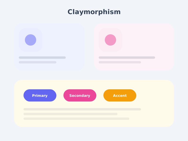
Examples
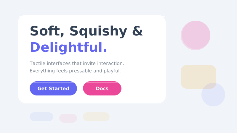
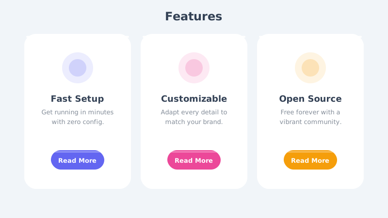
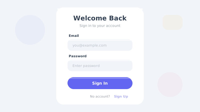
Color Palette
Typography
Key Characteristics
- Soft rounded shapes resembling clay
- Inner shadows for pressed-in effect
- Pastel and muted color palettes
- Gentle outer shadows for floating feel
- Rounded corners with high border-radius
- Playful 3D appearance without harsh edges
Tags
Claymorphism brings the tactile delight of modeling clay into digital interfaces. Inspired by the 3D illustration trend that swept product design in the early 2020s, this style makes UI elements look like they have been gently sculpted from soft, colorful clay. Every button feels pressable, every card feels liftable, and the entire interface invites interaction through its approachable, toy-like quality.
When to Use
Claymorphism is ideal for children’s apps, educational platforms, creative tools, onboarding flows, and any product that wants to feel friendly and approachable. It works wonderfully for consumer apps targeting non-technical audiences, gamified experiences, and brand websites that want to stand out with personality. Avoid it for data-heavy enterprise tools or contexts where users need to process large amounts of information quickly.
Key Visual Elements
The defining characteristic is the combination of inner and outer shadows that create the illusion of soft, rounded 3D forms. Outer shadows (typically 8-16px spread in a muted tone) make elements appear to float above the surface, while inner shadows on the top-left suggest a gentle light source hitting the clay. Colors are pastel and muted — never harsh or fully saturated. Border-radius values are generous (16-24px), and elements avoid sharp corners entirely. The overall effect is warm, inviting, and slightly whimsical.
Typography
Nunito is the perfect typeface for claymorphism — its rounded terminals and friendly proportions mirror the soft, rounded aesthetic of the style itself. Use it for both headings and body text to maintain visual consistency. Medium to semi-bold weights work best, avoiding the extremes of thin or black weights that would break the soft, approachable feel.
Export style
Choose a library mapping or use the CSS variables in your own components. JSON includes the same mapping. Load the listed fonts separately.
:root {
  --tx-surface-bg: #F1F5F9;
  --tx-font-heading: "Nunito", sans-serif;
  --tx-font-body: "Nunito", sans-serif;
  --tx-surface-bg-image: none;
  --tx-card-bg: #FFFFFF;
  --tx-card-border: transparent;
  --tx-card-border-width: 0px;
  --tx-card-radius: 2rem;
  --tx-card-shadow: 0 8px 24px rgba(99,102,241,0.08), inset 0 -4px 8px rgba(99,102,241,0.04);
  --tx-card-backdrop-blur: 0px;
  --tx-card-border-hover: transparent;
  --tx-card-shadow-hover: 0 12px 32px rgba(99,102,241,0.12), inset 0 -4px 8px rgba(99,102,241,0.06);
  --tx-font-heading-weight: 700;
  --tx-font-body-weight: 400;
  --tx-text-muted: rgba(51,65,85,0.7);
  --tx-text-subtle: rgba(51,65,85,0.5);
  --tx-link-color: #6366F1;
  --tx-button-radius: 1.5rem;
  --tx-input-bg: #FFFFFF;
  --tx-input-border: rgba(99,102,241,0.15);
  --tx-text: #334155;
  --tx-primary: #6366F1;
  --tx-secondary: #EC4899;
  --tx-accent: #F59E0B;
  --tx-media-filter: none;
}
Prompt Builder
Choose your project, UI library, and output. Prompts, documents, and exports use the same resolved theme values.
Use your own components with the exported CSS variables.
Claymorphism
Live component preview
Try the sample controls. daisyUI uses compiled library classes; shadcn/ui uses React components from the New York registry. The three example layouts demonstrate styling with the selected tokens. All content is demo data.
Copy this prompt into your coding assistant. The task mode applies to the UI prompt.
Generated prompt
You are building a web application using Next.js with Tailwind.
Read existing project instructions and reuse installed components where available.

## Project
Project brief: Not specified
Target users: Not specified
Page purpose: Education
Framework: Next.js
CSS approach: Tailwind
UI library: Custom / no library
Tone: Professional

## Visual direction
Base theme: Claymorphism (visual-effect)
- Soft rounded shapes resembling clay
- Inner shadows for pressed-in effect
- Pastel and muted color palettes
- Gentle outer shadows for floating feel
- Rounded corners with high border-radius
- Playful 3D appearance without harsh edges

## Resolved style
Use this final token set. It already includes the selected layers. These values take precedence over conflicting base characteristics.
Color palette: primary #6366F1, secondary #EC4899, accent #F59E0B, background #F1F5F9, text #334155
Typography: Nunito for headings, Nunito for body text
Load the declared fonts with the required weights. Use system fallbacks when a font is unavailable.
```css
:root {
  --tx-surface-bg: #F1F5F9;
  --tx-font-heading: "Nunito", sans-serif;
  --tx-font-body: "Nunito", sans-serif;
  --tx-surface-bg-image: none;
  --tx-card-bg: #FFFFFF;
  --tx-card-border: transparent;
  --tx-card-border-width: 0px;
  --tx-card-radius: 2rem;
  --tx-card-shadow: 0 8px 24px rgba(99,102,241,0.08), inset 0 -4px 8px rgba(99,102,241,0.04);
  --tx-card-backdrop-blur: 0px;
  --tx-card-border-hover: transparent;
  --tx-card-shadow-hover: 0 12px 32px rgba(99,102,241,0.12), inset 0 -4px 8px rgba(99,102,241,0.06);
  --tx-font-heading-weight: 700;
  --tx-font-body-weight: 400;
  --tx-text-muted: rgba(51,65,85,0.7);
  --tx-text-subtle: rgba(51,65,85,0.5);
  --tx-link-color: #6366F1;
  --tx-button-radius: 1.5rem;
  --tx-input-bg: #FFFFFF;
  --tx-input-border: rgba(99,102,241,0.15);
  --tx-text: #334155;
  --tx-primary: #6366F1;
  --tx-secondary: #EC4899;
  --tx-accent: #F59E0B;
  --tx-media-filter: none;
}
```
Use the CSS variables in your own components. Apply the heading and body font variables to their respective elements.

## Layout
- Group a few large rounded cards with consistent spacing.

## Interaction
- Use small hover lifts and avoid continuous bouncing on controls.

## Suitability notes
Use these limitations to assess the chosen page purpose. Explain any mismatch before applying an unsuitable treatment.
- Claymorphism: Dense professional interfaces where large rounded elements waste space.

## Components
Generate the following components in this style:
- Navbar
- Footer

## Quality requirements
Choose section order and visual emphasis from the real content and page purpose. Add only sections needed for the task.
Use supplied content. Label sample data. Do not invent testimonials, customer logos, statistics, or compliance claims.
Every interactive control must perform its declared action or be clearly labeled as a demo.
Include loading, empty, error, success, disabled, and focus states where applicable.
Use semantic HTML, visible keyboard focus, readable text contrast, and labeled form fields.
Ensure responsive design (mobile-first). Preserve reading order and avoid horizontal page overflow.
Respect prefers-reduced-motion. Keep essential content visible when animations are disabled.

## Verification
Check representative desktop and mobile widths, keyboard interaction, and relevant component states. Run available project checks and report what was actually verified.
Use Tailwind utility classes with the declared tokens.
Product context is incomplete. Label assumptions and treat the result as a draft until the missing context is supplied.