Gradient Mesh
elegant Visual effectFlowing colors that captivate and mesmerize
Reference year: 2022
Compare this themeBest for
SaaS, Portfolio, Brand & events
Less suitable for
- Dense data interfaces with gradients behind every text block.
Live component preview
Try the sample controls. daisyUI uses compiled library classes; shadcn/ui uses React components from the New York registry. The three example layouts demonstrate styling with the selected tokens. All content is demo data.
Examples
Color Palette
Typography
Key Characteristics
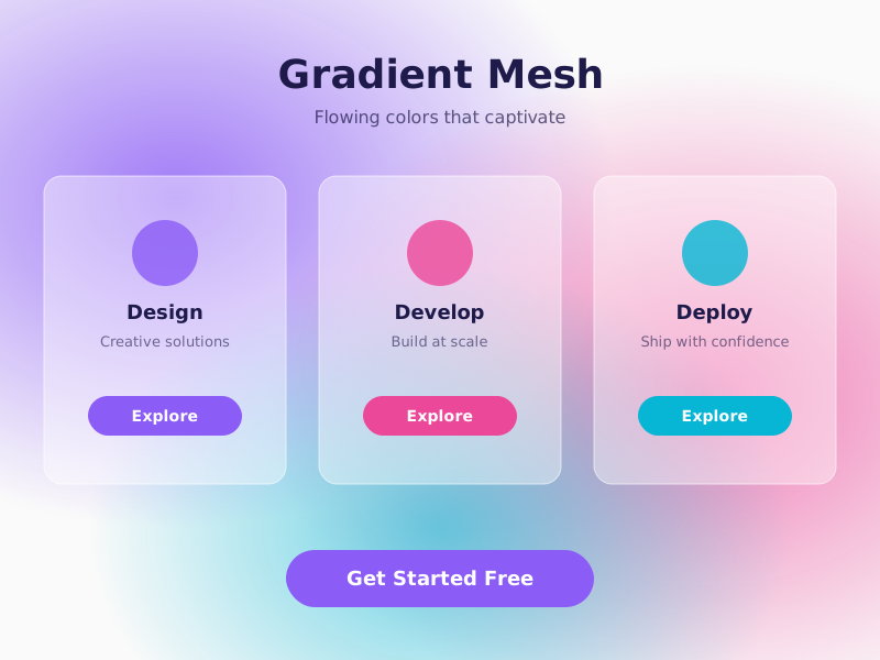
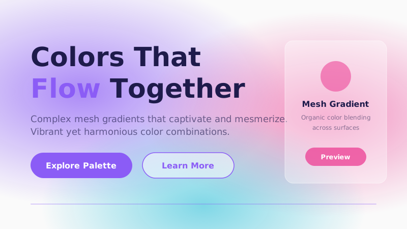
- Complex multi-stop gradient backgrounds
- Mesh gradients with organic color blending
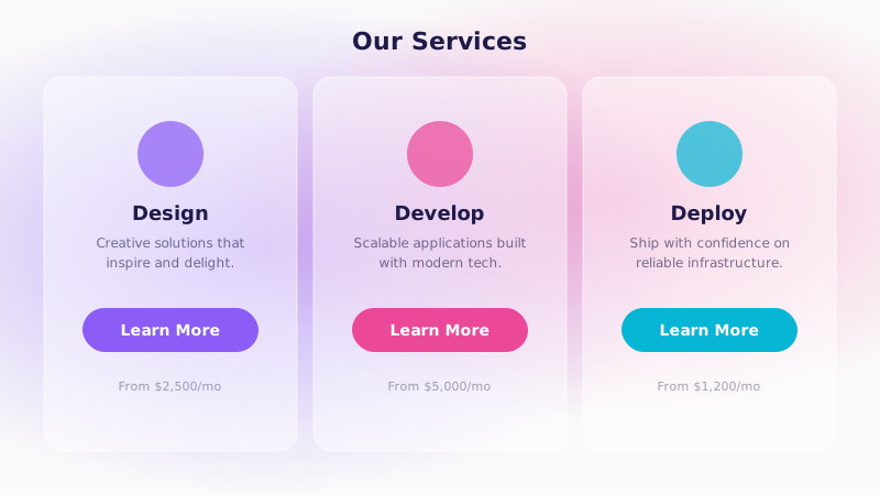
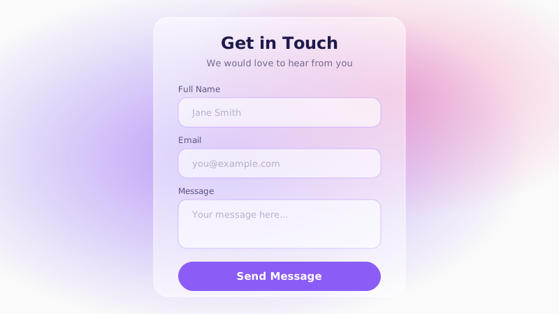
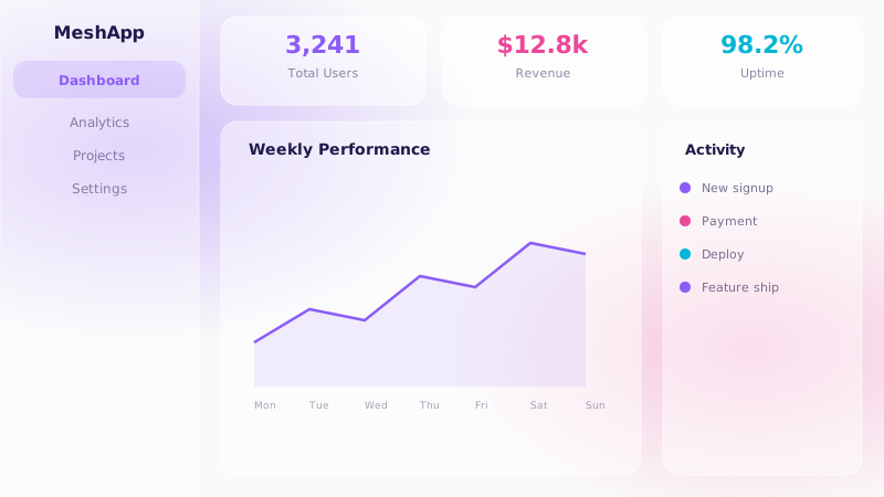
- Glass-effect cards layered over gradient backgrounds
- Smooth color transitions between page sections
- Vibrant yet harmonious color combinations
- Gradients serve as the primary visual element
Tags
Gradient mesh design elevates the humble color gradient into a rich, multi-dimensional visual language. Instead of simple two-color linear fades, mesh gradients blend three, four, or more colors across a two-dimensional field, creating organic, almost liquid backgrounds that feel alive. The trend gained momentum as tools like Figma and CSS Houdini made complex gradient creation accessible to every designer.
When to Use
Gradient mesh is ideal for creative agency sites, SaaS landing pages, portfolio headers, and any context where a strong first impression matters more than information density. It pairs beautifully with glassmorphism-style cards that float over the colorful background. Use it when you want to signal innovation, creativity, and a premium feel without relying on photography.
Key Visual Elements
The hero section typically features a large-scale mesh gradient — multiple color nodes blended with Gaussian-like falloff produce an ambient, aurora-style backdrop. Cards and panels use frosted-glass effects (backdrop-blur plus semi-transparent fills) to remain readable against the vivid background. Section transitions leverage gradient fades rather than hard dividers. The overall effect is fluid and continuous, as if the interface is painted rather than constructed.
Typography
Modern geometric sans-serifs like Cabinet Grotesk for headings and Satoshi for body text complement the smooth, contemporary feel of gradient mesh. Keep headings bold and large so they hold their own against colorful backgrounds. Dark text colors drawn from the deepest gradient hue (such as #1E1B4B) maintain readability while feeling visually integrated with the palette.
Export style
Choose a library mapping or use the CSS variables in your own components. JSON includes the same mapping. Load the listed fonts separately.
:root {
  --tx-surface-bg: #FAFAFA;
  --tx-font-heading: "Cabinet Grotesk", sans-serif;
  --tx-font-body: "Satoshi", sans-serif;
  --tx-surface-bg-image: radial-gradient(ellipse 80% 50% at 20% 40%, rgba(139,92,246,0.1), transparent), radial-gradient(ellipse 60% 50% at 80% 20%, rgba(236,72,153,0.08), transparent);
  --tx-card-bg: rgba(255,255,255,0.8);
  --tx-card-border: rgba(139,92,246,0.15);
  --tx-card-border-width: 1px;
  --tx-card-radius: 1.5rem;
  --tx-card-shadow: 0 4px 24px rgba(139,92,246,0.08);
  --tx-card-backdrop-blur: 12px;
  --tx-card-border-hover: rgba(139,92,246,0.3);
  --tx-card-shadow-hover: 0 8px 32px rgba(139,92,246,0.12);
  --tx-font-heading-weight: 700;
  --tx-font-body-weight: 400;
  --tx-text-muted: rgba(30,27,75,0.6);
  --tx-text-subtle: rgba(30,27,75,0.4);
  --tx-link-color: #8B5CF6;
  --tx-button-radius: 9999px;
  --tx-input-bg: rgba(255,255,255,0.6);
  --tx-input-border: rgba(139,92,246,0.2);
  --tx-text: #1E1B4B;
  --tx-primary: #8B5CF6;
  --tx-secondary: #EC4899;
  --tx-accent: #06B6D4;
  --tx-media-filter: none;
}
Prompt Builder
Choose your project, UI library, and output. Prompts, documents, and exports use the same resolved theme values.
Use your own components with the exported CSS variables.
Gradient Mesh
Live component preview
Try the sample controls. daisyUI uses compiled library classes; shadcn/ui uses React components from the New York registry. The three example layouts demonstrate styling with the selected tokens. All content is demo data.
Copy this prompt into your coding assistant. The task mode applies to the UI prompt.
Generated prompt
You are building a web application using Next.js with Tailwind.
Read existing project instructions and reuse installed components where available.

## Project
Project brief: Not specified
Target users: Not specified
Page purpose: SaaS
Framework: Next.js
CSS approach: Tailwind
UI library: Custom / no library
Tone: Professional

## Visual direction
Base theme: Gradient Mesh (visual-effect)
- Complex multi-stop gradient backgrounds
- Mesh gradients with organic color blending
- Glass-effect cards layered over gradient backgrounds
- Smooth color transitions between page sections
- Vibrant yet harmonious color combinations
- Gradients serve as the primary visual element

## Resolved style
Use this final token set. It already includes the selected layers. These values take precedence over conflicting base characteristics.
Color palette: primary #8B5CF6, secondary #EC4899, accent #06B6D4, background #FAFAFA, text #1E1B4B
Typography: Cabinet Grotesk for headings, Satoshi for body text
Load the declared fonts with the required weights. Use system fallbacks when a font is unavailable.
```css
:root {
  --tx-surface-bg: #FAFAFA;
  --tx-font-heading: "Cabinet Grotesk", sans-serif;
  --tx-font-body: "Satoshi", sans-serif;
  --tx-surface-bg-image: radial-gradient(ellipse 80% 50% at 20% 40%, rgba(139,92,246,0.1), transparent), radial-gradient(ellipse 60% 50% at 80% 20%, rgba(236,72,153,0.08), transparent);
  --tx-card-bg: rgba(255,255,255,0.8);
  --tx-card-border: rgba(139,92,246,0.15);
  --tx-card-border-width: 1px;
  --tx-card-radius: 1.5rem;
  --tx-card-shadow: 0 4px 24px rgba(139,92,246,0.08);
  --tx-card-backdrop-blur: 12px;
  --tx-card-border-hover: rgba(139,92,246,0.3);
  --tx-card-shadow-hover: 0 8px 32px rgba(139,92,246,0.12);
  --tx-font-heading-weight: 700;
  --tx-font-body-weight: 400;
  --tx-text-muted: rgba(30,27,75,0.6);
  --tx-text-subtle: rgba(30,27,75,0.4);
  --tx-link-color: #8B5CF6;
  --tx-button-radius: 9999px;
  --tx-input-bg: rgba(255,255,255,0.6);
  --tx-input-border: rgba(139,92,246,0.2);
  --tx-text: #1E1B4B;
  --tx-primary: #8B5CF6;
  --tx-secondary: #EC4899;
  --tx-accent: #06B6D4;
  --tx-media-filter: none;
}
```
Use the CSS variables in your own components. Apply the heading and body font variables to their respective elements.

## Layout
- Use a mesh gradient as the page background with simple foreground sections.

## Interaction
- Keep gradient animation optional and preserve contrast in every frame.

## Suitability notes
Use these limitations to assess the chosen page purpose. Explain any mismatch before applying an unsuitable treatment.
- Gradient Mesh: Dense data interfaces with gradients behind every text block.

## Components
Generate the following components in this style:
- Hero
- Navbar
- Cards
- Footer

## Quality requirements
Choose section order and visual emphasis from the real content and page purpose. Add only sections needed for the task.
Use supplied content. Label sample data. Do not invent testimonials, customer logos, statistics, or compliance claims.
Every interactive control must perform its declared action or be clearly labeled as a demo.
Include loading, empty, error, success, disabled, and focus states where applicable.
Use semantic HTML, visible keyboard focus, readable text contrast, and labeled form fields.
Ensure responsive design (mobile-first). Preserve reading order and avoid horizontal page overflow.
Respect prefers-reduced-motion. Keep essential content visible when animations are disabled.

## Verification
Check representative desktop and mobile widths, keyboard interaction, and relevant component states. Run available project checks and report what was actually verified.
Use Tailwind utility classes with the declared tokens.
Product context is incomplete. Label assumptions and treat the result as a draft until the missing context is supplied.