Japandi
minimalist Visual styleWhere Japanese zen meets Scandinavian warmth
Reference year: 2025
Compare this themeBest for
Ecommerce, Editorial, Portfolio
Less suitable for
- Dense dashboards and high-energy promotional campaigns.
Live component preview
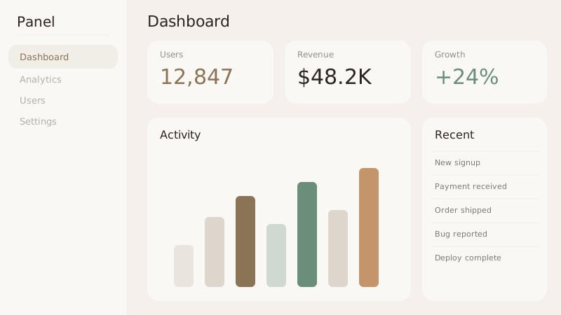
Try the sample controls. daisyUI uses compiled library classes; shadcn/ui uses React components from the New York registry. The three example layouts demonstrate styling with the selected tokens. All content is demo data.
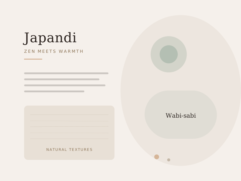
Examples
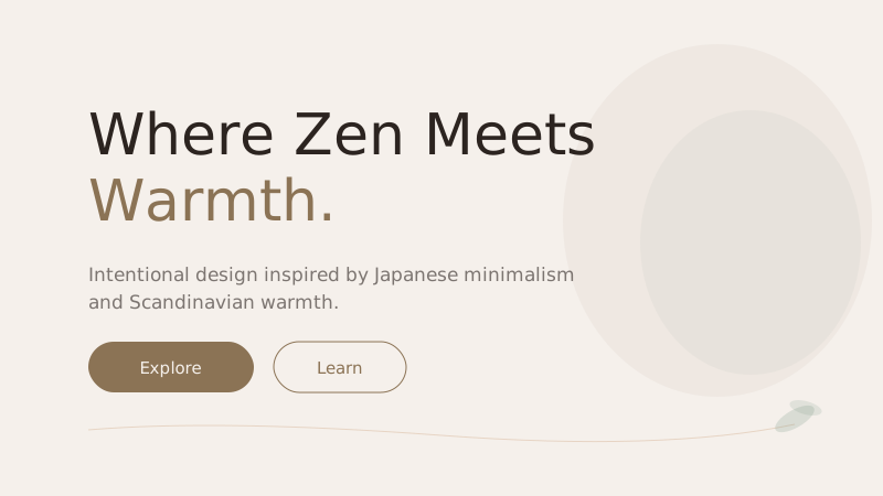
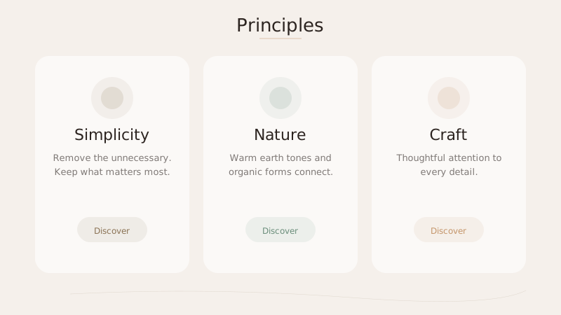
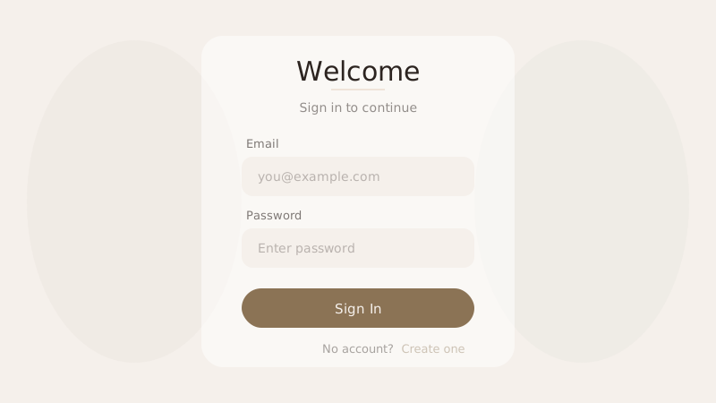
Color Palette
Typography
Key Characteristics
- Warm neutral earth tones
- Generous negative space
- Organic shapes and rounded forms
- Natural material textures (wood grain linen)
- Asymmetric balance
- Restrained use of accent colors
Tags
Japandi is the harmonious fusion of Japanese wabi-sabi philosophy and Scandinavian hygge sensibility. Both traditions share a reverence for simplicity, craftsmanship, and nature, but they arrive there from different directions — Japanese design through contemplative restraint, Scandinavian design through functional warmth. The result is a style that feels simultaneously serene and inviting, minimal yet never cold or sterile.
When to Use
Japandi is perfectly suited for lifestyle brands, wellness and mindfulness apps, interior design portfolios, artisan and craft marketplaces, and sustainable fashion e-commerce. It works beautifully for any project that wants to communicate intentionality, quality, and a connection to the natural world. It is an excellent choice when you need the breathing room of minimalism but want to avoid the clinical feeling that can come with stark, cool-toned minimal styles.
Key Visual Elements
The color palette is drawn from nature: warm browns and tans reminiscent of raw wood, muted greens evoking moss and sage, and soft creams like unbleached linen. Shapes tend toward organic and rounded rather than sharp and geometric. Textures — wood grain, woven fabric, handmade paper — add tactile warmth even in a digital medium. Generous negative space creates a meditative quality, and elements are arranged with asymmetric balance that feels natural rather than calculated.
Typography
Cormorant Garamond brings a refined, slightly editorial quality to headings that pairs beautifully with the warmth of the color palette. Source Sans 3 provides clean, humanist readability for body text. Keep weights light to medium and line heights generous. The typography should feel effortless, as if the words simply settled into their natural resting place on the page.
Export style
Choose a library mapping or use the CSS variables in your own components. JSON includes the same mapping. Load the listed fonts separately.
:root {
  --tx-surface-bg: #F5F0EB;
  --tx-font-heading: "Cormorant Garamond", sans-serif;
  --tx-font-body: "Source Sans 3", sans-serif;
  --tx-surface-bg-image: none;
  --tx-card-bg: #FFFFFF;
  --tx-card-border: rgba(139,115,85,0.15);
  --tx-card-border-width: 1px;
  --tx-card-radius: 0.5rem;
  --tx-card-shadow: 0 2px 8px rgba(44,36,32,0.04);
  --tx-card-backdrop-blur: 0px;
  --tx-card-border-hover: rgba(139,115,85,0.3);
  --tx-card-shadow-hover: 0 4px 12px rgba(44,36,32,0.08);
  --tx-font-heading-weight: 600;
  --tx-font-body-weight: 400;
  --tx-text-muted: rgba(44,36,32,0.7);
  --tx-text-subtle: rgba(44,36,32,0.5);
  --tx-link-color: #8B7355;
  --tx-button-radius: 0.25rem;
  --tx-input-bg: #FFFFFF;
  --tx-input-border: rgba(139,115,85,0.2);
  --tx-text: #2C2420;
  --tx-primary: #8B7355;
  --tx-secondary: #6B8E7B;
  --tx-accent: #C4956A;
  --tx-media-filter: none;
}
Prompt Builder
Choose your project, UI library, and output. Prompts, documents, and exports use the same resolved theme values.
Use your own components with the exported CSS variables.
Japandi
Live component preview
Try the sample controls. daisyUI uses compiled library classes; shadcn/ui uses React components from the New York registry. The three example layouts demonstrate styling with the selected tokens. All content is demo data.
Copy this prompt into your coding assistant. The task mode applies to the UI prompt.
Generated prompt
You are building a web application using Next.js with Tailwind.
Read existing project instructions and reuse installed components where available.

## Project
Project brief: Not specified
Target users: Not specified
Page purpose: Ecommerce
Framework: Next.js
CSS approach: Tailwind
UI library: Custom / no library
Tone: Professional

## Visual direction
Base theme: Japandi (visual-style)
- Warm neutral earth tones
- Generous negative space
- Organic shapes and rounded forms
- Natural material textures (wood grain linen)
- Asymmetric balance
- Restrained use of accent colors

## Resolved style
Use this final token set. It already includes the selected layers. These values take precedence over conflicting base characteristics.
Color palette: primary #8B7355, secondary #6B8E7B, accent #C4956A, background #F5F0EB, text #2C2420
Typography: Cormorant Garamond for headings, Source Sans 3 for body text
Load the declared fonts with the required weights. Use system fallbacks when a font is unavailable.
```css
:root {
  --tx-surface-bg: #F5F0EB;
  --tx-font-heading: "Cormorant Garamond", sans-serif;
  --tx-font-body: "Source Sans 3", sans-serif;
  --tx-surface-bg-image: none;
  --tx-card-bg: #FFFFFF;
  --tx-card-border: rgba(139,115,85,0.15);
  --tx-card-border-width: 1px;
  --tx-card-radius: 0.5rem;
  --tx-card-shadow: 0 2px 8px rgba(44,36,32,0.04);
  --tx-card-backdrop-blur: 0px;
  --tx-card-border-hover: rgba(139,115,85,0.3);
  --tx-card-shadow-hover: 0 4px 12px rgba(44,36,32,0.08);
  --tx-font-heading-weight: 600;
  --tx-font-body-weight: 400;
  --tx-text-muted: rgba(44,36,32,0.7);
  --tx-text-subtle: rgba(44,36,32,0.5);
  --tx-link-color: #8B7355;
  --tx-button-radius: 0.25rem;
  --tx-input-bg: #FFFFFF;
  --tx-input-border: rgba(139,115,85,0.2);
  --tx-text: #2C2420;
  --tx-primary: #8B7355;
  --tx-secondary: #6B8E7B;
  --tx-accent: #C4956A;
  --tx-media-filter: none;
}
```
Use the CSS variables in your own components. Apply the heading and body font variables to their respective elements.

## Layout
- Use generous whitespace, restrained asymmetry, and small groups of content.

## Interaction
- Use quiet opacity transitions and keep all controls visibly interactive.

## Suitability notes
Use these limitations to assess the chosen page purpose. Explain any mismatch before applying an unsuitable treatment.
- Japandi: Dense dashboards and high-energy promotional campaigns.

## Components
Generate the following components in this style:
- Navbar
- Cards
- Buttons
- Forms

## Quality requirements
Choose section order and visual emphasis from the real content and page purpose. Add only sections needed for the task.
Use supplied content. Label sample data. Do not invent testimonials, customer logos, statistics, or compliance claims.
Every interactive control must perform its declared action or be clearly labeled as a demo.
Include loading, empty, error, success, disabled, and focus states where applicable.
Use semantic HTML, visible keyboard focus, readable text contrast, and labeled form fields.
Ensure responsive design (mobile-first). Preserve reading order and avoid horizontal page overflow.
Respect prefers-reduced-motion. Keep essential content visible when animations are disabled.

## Verification
Check representative desktop and mobile widths, keyboard interaction, and relevant component states. Run available project checks and report what was actually verified.
Use Tailwind utility classes with the declared tokens.
Product context is incomplete. Label assumptions and treat the result as a draft until the missing context is supplied.