Material Design 3
corporate Design systemGoogle's evolved design language
Reference year: 2024
Compare this themeBest for
Dashboard, SaaS, Education
Less suitable for
- Projects that must follow a different established design system.
Live component preview
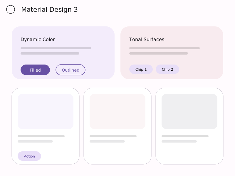
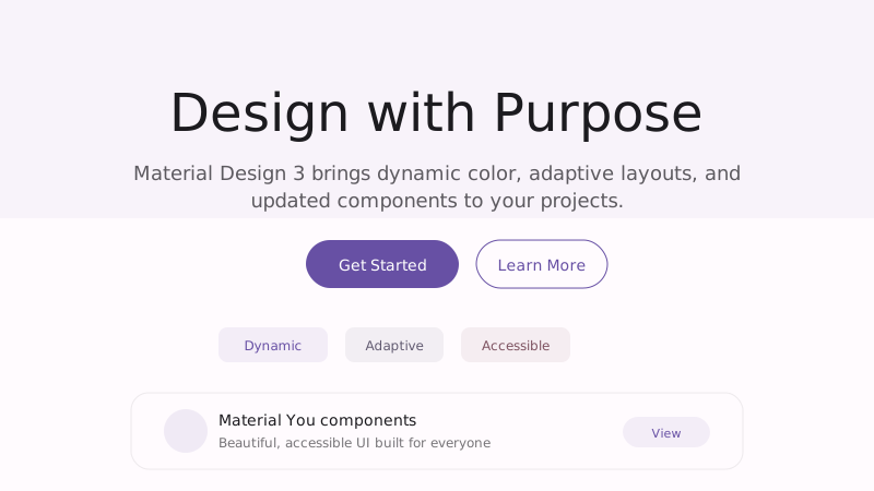
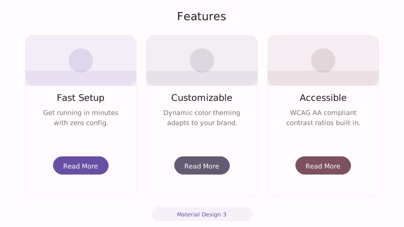
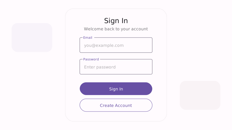
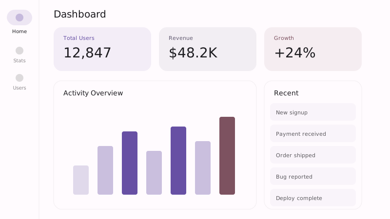
Try the sample controls. daisyUI uses compiled library classes; shadcn/ui uses React components from the New York registry. The three example layouts demonstrate styling with the selected tokens. All content is demo data.
Examples
Color Palette
Typography
Key Characteristics
- Dynamic color theming
- Rounded shapes (fully rounded buttons)
- Elevation with tonal surfaces
- Motion and transitions
- Component-based architecture
- Accessible contrast ratios
Tags
Material Design 3 (also known as Material You) represents Google’s evolution from a rigid specification into a flexible, expressive design system. Introduced alongside Android 12, it emphasizes personal expression through dynamic color, adaptive layouts, and updated component designs. M3 moves away from the sharp edges and prominent shadows of earlier Material versions toward softer shapes, tonal color surfaces, and a warmer overall feel.
When to Use
Material Design 3 is the natural choice for Android applications, cross-platform apps targeting Google’s ecosystem, enterprise tools that need a well-documented component library, and any project that values accessibility and systematic design. Its comprehensive specification and extensive component library make it particularly efficient for teams that need to move fast without sacrificing quality or consistency.
Key Visual Elements
Tonal surfaces replace the heavy drop shadows of earlier Material Design. Instead of floating cards casting dark shadows, M3 uses subtle color tinting to create elevation — surfaces get slightly lighter or more tinted as they rise in the z-axis. Shapes are rounder: buttons use full border-radius, chips and badges are pill-shaped, and containers have generous corner rounding. The dynamic color system derives an entire palette from a single seed color, ensuring harmony across the interface.
Typography
Roboto remains the typeface of choice, but M3 uses it with more nuance — lighter weights, more generous line heights, and a type scale that ranges from Display (large hero text) down to Label (small UI text). The type system is organized into roles rather than fixed sizes, making it adaptable across screen sizes.
Export style
Choose a library mapping or use the CSS variables in your own components. JSON includes the same mapping. Load the listed fonts separately.
:root {
  --tx-surface-bg: #FFFBFE;
  --tx-font-heading: "Roboto", sans-serif;
  --tx-font-body: "Roboto", sans-serif;
  --tx-surface-bg-image: none;
  --tx-card-bg: #FFFBFE;
  --tx-card-border: rgba(103,80,164,0.12);
  --tx-card-border-width: 0px;
  --tx-card-radius: 1.5rem;
  --tx-card-shadow: 0 1px 3px rgba(0,0,0,0.08), 0 1px 2px rgba(0,0,0,0.06);
  --tx-card-backdrop-blur: 0px;
  --tx-card-border-hover: rgba(103,80,164,0.2);
  --tx-card-shadow-hover: 0 4px 8px rgba(0,0,0,0.12), 0 2px 4px rgba(0,0,0,0.08);
  --tx-font-heading-weight: 500;
  --tx-font-body-weight: 400;
  --tx-text-muted: rgba(28,27,31,0.6);
  --tx-text-subtle: rgba(28,27,31,0.4);
  --tx-link-color: #6750A4;
  --tx-button-radius: 9999px;
  --tx-input-bg: #FFFBFE;
  --tx-input-border: rgba(28,27,31,0.2);
  --tx-text: #1C1B1F;
  --tx-primary: #6750A4;
  --tx-secondary: #625B71;
  --tx-accent: #7D5260;
  --tx-media-filter: none;
}
Prompt Builder
Choose your project, UI library, and output. Prompts, documents, and exports use the same resolved theme values.
Use your own components with the exported CSS variables.
Material Design 3
Live component preview
Try the sample controls. daisyUI uses compiled library classes; shadcn/ui uses React components from the New York registry. The three example layouts demonstrate styling with the selected tokens. All content is demo data.
Copy this prompt into your coding assistant. The task mode applies to the UI prompt.
Generated prompt
You are building a web application using Next.js with Tailwind.
Read existing project instructions and reuse installed components where available.

## Project
Project brief: Not specified
Target users: Not specified
Page purpose: Dashboard
Framework: Next.js
CSS approach: Tailwind
UI library: Custom / no library
Tone: Professional

## Visual direction
Base theme: Material Design 3 (design-system)
- Dynamic color theming
- Rounded shapes (fully rounded buttons)
- Elevation with tonal surfaces
- Motion and transitions
- Component-based architecture
- Accessible contrast ratios

## Resolved style
Use this final token set. It already includes the selected layers. These values take precedence over conflicting base characteristics.
Color palette: primary #6750A4, secondary #625B71, accent #7D5260, background #FFFBFE, text #1C1B1F
Typography: Roboto for headings, Roboto for body text
Load the declared fonts with the required weights. Use system fallbacks when a font is unavailable.
```css
:root {
  --tx-surface-bg: #FFFBFE;
  --tx-font-heading: "Roboto", sans-serif;
  --tx-font-body: "Roboto", sans-serif;
  --tx-surface-bg-image: none;
  --tx-card-bg: #FFFBFE;
  --tx-card-border: rgba(103,80,164,0.12);
  --tx-card-border-width: 0px;
  --tx-card-radius: 1.5rem;
  --tx-card-shadow: 0 1px 3px rgba(0,0,0,0.08), 0 1px 2px rgba(0,0,0,0.06);
  --tx-card-backdrop-blur: 0px;
  --tx-card-border-hover: rgba(103,80,164,0.2);
  --tx-card-shadow-hover: 0 4px 8px rgba(0,0,0,0.12), 0 2px 4px rgba(0,0,0,0.08);
  --tx-font-heading-weight: 500;
  --tx-font-body-weight: 400;
  --tx-text-muted: rgba(28,27,31,0.6);
  --tx-text-subtle: rgba(28,27,31,0.4);
  --tx-link-color: #6750A4;
  --tx-button-radius: 9999px;
  --tx-input-bg: #FFFBFE;
  --tx-input-border: rgba(28,27,31,0.2);
  --tx-text: #1C1B1F;
  --tx-primary: #6750A4;
  --tx-secondary: #625B71;
  --tx-accent: #7D5260;
  --tx-media-filter: none;
}
```
Use the CSS variables in your own components. Apply the heading and body font variables to their respective elements.

## Layout
- Use consistent component hierarchy, generous touch targets, and distinct surface levels.

## Interaction
- Use clear focus, pressed, disabled, and validation states with restrained transitions.

## Suitability notes
Use these limitations to assess the chosen page purpose. Explain any mismatch before applying an unsuitable treatment.
- Material Design 3: Projects that must follow a different established design system.

## Components
Generate the following components in this style:
- Sidebar
- Tables
- Forms

## Quality requirements
Choose section order and visual emphasis from the real content and page purpose. Add only sections needed for the task.
Use supplied content. Label sample data. Do not invent testimonials, customer logos, statistics, or compliance claims.
Every interactive control must perform its declared action or be clearly labeled as a demo.
Include loading, empty, error, success, disabled, and focus states where applicable.
Use semantic HTML, visible keyboard focus, readable text contrast, and labeled form fields.
Ensure responsive design (mobile-first). Preserve reading order and avoid horizontal page overflow.
Respect prefers-reduced-motion. Keep essential content visible when animations are disabled.

## Verification
Check representative desktop and mobile widths, keyboard interaction, and relevant component states. Run available project checks and report what was actually verified.
Use Tailwind utility classes with the declared tokens.
Product context is incomplete. Label assumptions and treat the result as a draft until the missing context is supplied.