Maximalism
bold Visual styleMore is more, and then some
Reference year: 2025
Compare this themeBest for
Portfolio, Games & entertainment, Brand & events
Less suitable for
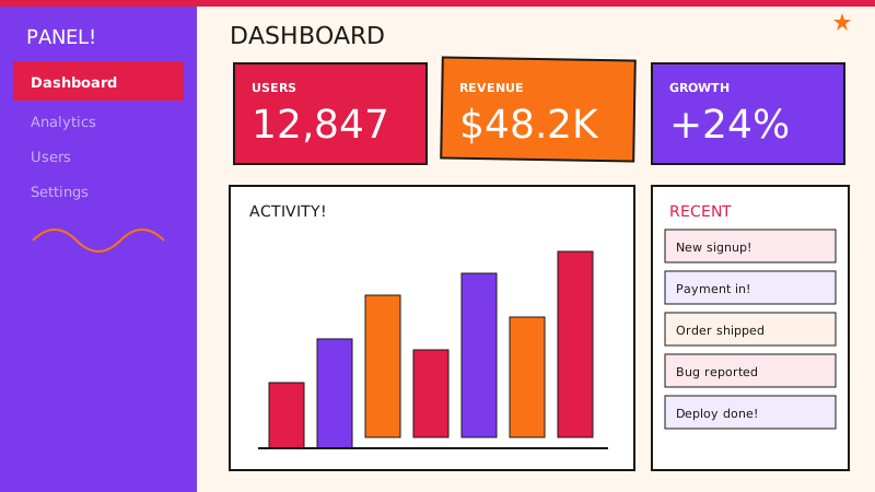
- Operational dashboards where decorative density competes with data.
Live component preview
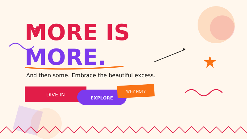
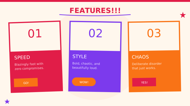
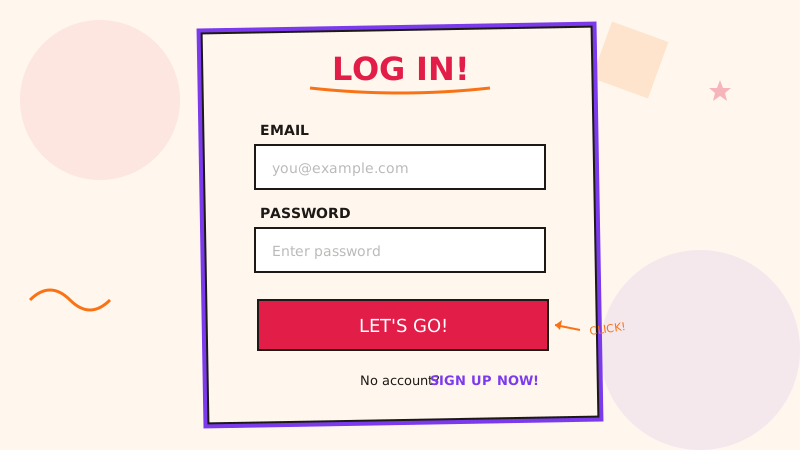
Try the sample controls. daisyUI uses compiled library classes; shadcn/ui uses React components from the New York registry. The three example layouts demonstrate styling with the selected tokens. All content is demo data.
Examples
Color Palette
Typography
Key Characteristics
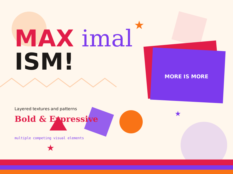
- Multiple competing visual elements
- Mixed typography styles and sizes
- Bold clashing color combinations
- Layered textures and patterns
- Oversized decorative elements
- Deliberate visual chaos with underlying structure
Tags
Maximalism is the rebellious counterpoint to the minimalist dominance that has defined digital design for over a decade. Where minimalism removes, maximalism accumulates. Where minimalism whispers, maximalism roars. This style embraces excess as an expressive tool — layering colors, textures, typography, and imagery to create rich, immersive visual experiences that demand attention and reward exploration.
When to Use
Maximalism thrives in creative portfolios, music and entertainment sites, editorial and magazine layouts, fashion brands, and cultural institutions. It is ideal when you want to communicate energy, creativity, and boldness. It works well for brands that target younger, digitally native audiences who are comfortable with visual complexity. Avoid it for utility-focused applications like banking or healthcare where clarity and calm are essential.
Key Visual Elements
Expect collisions: overlapping elements, mixed media (photography combined with illustration combined with geometric shapes), and clashing colors that somehow harmonize through sheer confidence. Backgrounds may feature patterns, textures, or gradients rather than solid colors. Decorative elements — squiggles, stars, arrows, underlines — are scattered generously. Nothing is subtle, and the visual hierarchy comes not from restraint but from making the most important element the loudest in the room.
Typography
Mix and match is encouraged. Pair Archivo Black for impactful headlines with DM Sans for readable body text, but do not hesitate to introduce a third or fourth typeface for pull quotes, labels, or decorative text. Vary sizes dramatically — a heading might be 120px while a caption sits at 12px. Rotation, color changes within words, and unconventional line breaks are all fair game.
Export style
Choose a library mapping or use the CSS variables in your own components. JSON includes the same mapping. Load the listed fonts separately.
:root {
  --tx-surface-bg: #FFF7ED;
  --tx-font-heading: "Archivo Black", sans-serif;
  --tx-font-body: "DM Sans", sans-serif;
  --tx-surface-bg-image: radial-gradient(ellipse 80% 50% at 20% 40%, rgba(225,29,72,0.08), transparent), radial-gradient(ellipse 60% 50% at 80% 60%, rgba(124,58,237,0.06), transparent);
  --tx-card-bg: #FFFFFF;
  --tx-card-border: #E11D48;
  --tx-card-border-width: 2px;
  --tx-card-radius: 1rem;
  --tx-card-shadow: 4px 4px 0 rgba(225,29,72,0.2);
  --tx-card-backdrop-blur: 0px;
  --tx-card-border-hover: #7C3AED;
  --tx-card-shadow-hover: 6px 6px 0 rgba(124,58,237,0.2);
  --tx-font-heading-weight: 400;
  --tx-font-body-weight: 400;
  --tx-text-muted: rgba(28,25,23,0.7);
  --tx-text-subtle: rgba(28,25,23,0.5);
  --tx-link-color: #E11D48;
  --tx-button-radius: 0.5rem;
  --tx-input-bg: #FFFFFF;
  --tx-input-border: #E11D48;
  --tx-text: #1C1917;
  --tx-primary: #E11D48;
  --tx-secondary: #7C3AED;
  --tx-accent: #F97316;
  --tx-media-filter: none;
}
Prompt Builder
Choose your project, UI library, and output. Prompts, documents, and exports use the same resolved theme values.
Use your own components with the exported CSS variables.
Maximalism
Live component preview
Try the sample controls. daisyUI uses compiled library classes; shadcn/ui uses React components from the New York registry. The three example layouts demonstrate styling with the selected tokens. All content is demo data.
Copy this prompt into your coding assistant. The task mode applies to the UI prompt.
Generated prompt
You are building a web application using Next.js with Tailwind.
Read existing project instructions and reuse installed components where available.

## Project
Project brief: Not specified
Target users: Not specified
Page purpose: Portfolio
Framework: Next.js
CSS approach: Tailwind
UI library: Custom / no library
Tone: Professional

## Visual direction
Base theme: Maximalism (visual-style)
- Multiple competing visual elements
- Mixed typography styles and sizes
- Bold clashing color combinations
- Layered textures and patterns
- Oversized decorative elements
- Deliberate visual chaos with underlying structure

## Resolved style
Use this final token set. It already includes the selected layers. These values take precedence over conflicting base characteristics.
Color palette: primary #E11D48, secondary #7C3AED, accent #F97316, background #FFF7ED, text #1C1917
Typography: Archivo Black for headings, DM Sans for body text
Load the declared fonts with the required weights. Use system fallbacks when a font is unavailable.
```css
:root {
  --tx-surface-bg: #FFF7ED;
  --tx-font-heading: "Archivo Black", sans-serif;
  --tx-font-body: "DM Sans", sans-serif;
  --tx-surface-bg-image: radial-gradient(ellipse 80% 50% at 20% 40%, rgba(225,29,72,0.08), transparent), radial-gradient(ellipse 60% 50% at 80% 60%, rgba(124,58,237,0.06), transparent);
  --tx-card-bg: #FFFFFF;
  --tx-card-border: #E11D48;
  --tx-card-border-width: 2px;
  --tx-card-radius: 1rem;
  --tx-card-shadow: 4px 4px 0 rgba(225,29,72,0.2);
  --tx-card-backdrop-blur: 0px;
  --tx-card-border-hover: #7C3AED;
  --tx-card-shadow-hover: 6px 6px 0 rgba(124,58,237,0.2);
  --tx-font-heading-weight: 400;
  --tx-font-body-weight: 400;
  --tx-text-muted: rgba(28,25,23,0.7);
  --tx-text-subtle: rgba(28,25,23,0.5);
  --tx-link-color: #E11D48;
  --tx-button-radius: 0.5rem;
  --tx-input-bg: #FFFFFF;
  --tx-input-border: #E11D48;
  --tx-text: #1C1917;
  --tx-primary: #E11D48;
  --tx-secondary: #7C3AED;
  --tx-accent: #F97316;
  --tx-media-filter: none;
}
```
Use the CSS variables in your own components. Apply the heading and body font variables to their respective elements.

## Layout
- Use deliberate visual groups so contrasting colors and shapes retain a reading order.

## Interaction
- Limit motion to one focal element at a time and keep navigation predictable.

## Suitability notes
Use these limitations to assess the chosen page purpose. Explain any mismatch before applying an unsuitable treatment.
- Maximalism: Operational dashboards where decorative density competes with data.

## Components
Generate the following components in this style:
- Hero
- Navbar
- Cards
- Footer

## Quality requirements
Choose section order and visual emphasis from the real content and page purpose. Add only sections needed for the task.
Use supplied content. Label sample data. Do not invent testimonials, customer logos, statistics, or compliance claims.
Every interactive control must perform its declared action or be clearly labeled as a demo.
Include loading, empty, error, success, disabled, and focus states where applicable.
Use semantic HTML, visible keyboard focus, readable text contrast, and labeled form fields.
Ensure responsive design (mobile-first). Preserve reading order and avoid horizontal page overflow.
Respect prefers-reduced-motion. Keep essential content visible when animations are disabled.

## Verification
Check representative desktop and mobile widths, keyboard interaction, and relevant component states. Run available project checks and report what was actually verified.
Use Tailwind utility classes with the declared tokens.
Product context is incomplete. Label assumptions and treat the result as a draft until the missing context is supplied.