Neumorphism
minimalist Visual effectSoft shadows that make elements float
Reference year: 2020
Compare this themeBest for
SaaS, Dashboard, Portfolio
Less suitable for
- Forms where subtle shadows are the only visible boundary or state indicator.
Live component preview
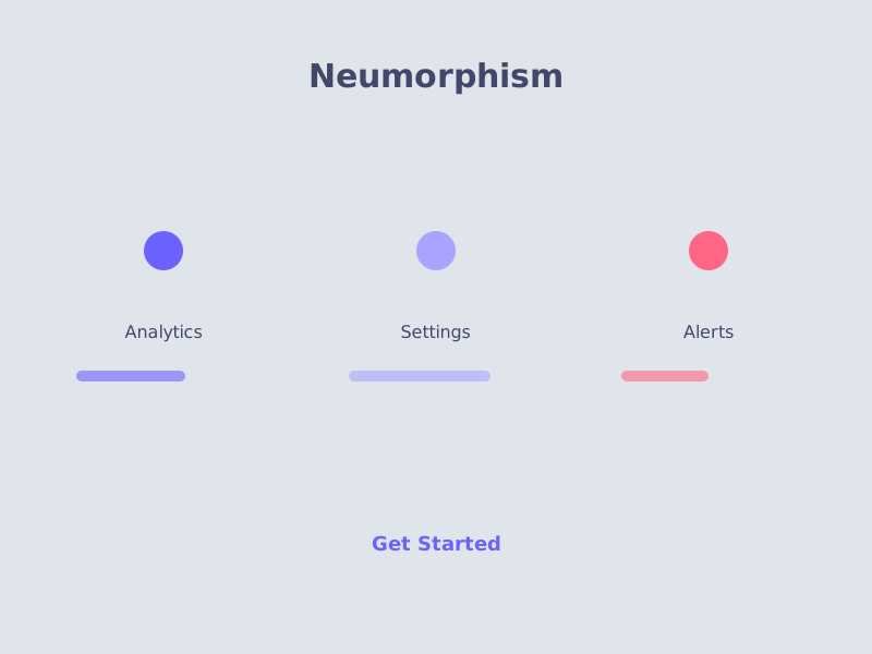
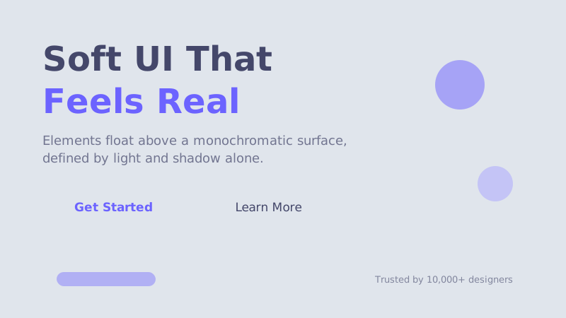
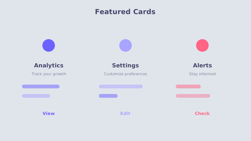
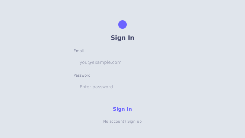
Try the sample controls. daisyUI uses compiled library classes; shadcn/ui uses React components from the New York registry. The three example layouts demonstrate styling with the selected tokens. All content is demo data.
Examples
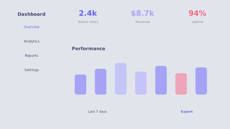
Color Palette
Typography
Key Characteristics
- Soft inner and outer shadows creating depth
- Monochromatic color schemes with subtle variations
- Elements appear extruded from the background surface
- Minimal use of borders — depth through shadow only
- Subtle pressed and unpressed states for interactivity
- Light backgrounds with shadow-based contrast
Tags
Neumorphism — also known as soft UI — emerged around 2020 as a stylistic evolution bridging flat design and skeuomorphism. It relies entirely on carefully tuned box shadows to create the illusion that interface elements are extruded from or pressed into a single continuous surface. The result feels tactile yet minimal, like molded plastic or clay.
When to Use
Neumorphism works best for personal dashboards, music players, smart-home controls, and lifestyle apps where an understated, premium feel is desired. Because the effect depends on a uniform light-colored background, it suits interfaces with limited color variety and focused interaction areas. Avoid it for text-heavy or data-dense screens where accessibility demands stronger contrast.
Key Visual Elements
The defining feature is the dual-shadow technique: a light shadow (usually white or near-white) on one side and a darker shadow on the opposite side simulate a single directional light source. Backgrounds, cards, and buttons share the same base hue, differing only in shadow direction and intensity. Borders are almost never used — depth and separation come exclusively from shadows. Pressed states simply invert the shadow direction, creating a concave impression.
Typography
Choose rounded, friendly sans-serif typefaces. Poppins works well for headings with its geometric warmth, while Rubik provides comfortable readability for body text. Keep font weights moderate — ultra-bold type competes with the subtle shadow aesthetic. Use the text color sparingly against the light background, relying on size and weight rather than color for hierarchy.
Export style
Choose a library mapping or use the CSS variables in your own components. JSON includes the same mapping. Load the listed fonts separately.
:root {
  --tx-surface-bg: #E0E5EC;
  --tx-font-heading: "Poppins", sans-serif;
  --tx-font-body: "Rubik", sans-serif;
  --tx-surface-bg-image: none;
  --tx-card-bg: #E0E5EC;
  --tx-card-border: transparent;
  --tx-card-border-width: 0px;
  --tx-card-radius: 1rem;
  --tx-card-shadow: 8px 8px 16px #b8bec7, -8px -8px 16px #ffffff;
  --tx-card-backdrop-blur: 0px;
  --tx-card-border-hover: transparent;
  --tx-card-shadow-hover: 6px 6px 12px #b8bec7, -6px -6px 12px #ffffff;
  --tx-font-heading-weight: 600;
  --tx-font-body-weight: 400;
  --tx-text-muted: rgba(68,71,106,0.7);
  --tx-text-subtle: rgba(68,71,106,0.5);
  --tx-link-color: #6C63FF;
  --tx-button-radius: 1rem;
  --tx-input-bg: #E0E5EC;
  --tx-input-border: transparent;
  --tx-text: #44476A;
  --tx-primary: #6C63FF;
  --tx-secondary: #A8A4FF;
  --tx-accent: #FF6584;
  --tx-media-filter: none;
}
Prompt Builder
Choose your project, UI library, and output. Prompts, documents, and exports use the same resolved theme values.
Use your own components with the exported CSS variables.
Neumorphism
Live component preview
Try the sample controls. daisyUI uses compiled library classes; shadcn/ui uses React components from the New York registry. The three example layouts demonstrate styling with the selected tokens. All content is demo data.
Copy this prompt into your coding assistant. The task mode applies to the UI prompt.
Generated prompt
You are building a web application using Next.js with Tailwind.
Read existing project instructions and reuse installed components where available.

## Project
Project brief: Not specified
Target users: Not specified
Page purpose: SaaS
Framework: Next.js
CSS approach: Tailwind
UI library: Custom / no library
Tone: Professional

## Visual direction
Base theme: Neumorphism (visual-effect)
- Soft inner and outer shadows creating depth
- Monochromatic color schemes with subtle variations
- Elements appear extruded from the background surface
- Minimal use of borders — depth through shadow only
- Subtle pressed and unpressed states for interactivity
- Light backgrounds with shadow-based contrast

## Resolved style
Use this final token set. It already includes the selected layers. These values take precedence over conflicting base characteristics.
Color palette: primary #6C63FF, secondary #A8A4FF, accent #FF6584, background #E0E5EC, text #44476A
Typography: Poppins for headings, Rubik for body text
Load the declared fonts with the required weights. Use system fallbacks when a font is unavailable.
```css
:root {
  --tx-surface-bg: #E0E5EC;
  --tx-font-heading: "Poppins", sans-serif;
  --tx-font-body: "Rubik", sans-serif;
  --tx-surface-bg-image: none;
  --tx-card-bg: #E0E5EC;
  --tx-card-border: transparent;
  --tx-card-border-width: 0px;
  --tx-card-radius: 1rem;
  --tx-card-shadow: 8px 8px 16px #b8bec7, -8px -8px 16px #ffffff;
  --tx-card-backdrop-blur: 0px;
  --tx-card-border-hover: transparent;
  --tx-card-shadow-hover: 6px 6px 12px #b8bec7, -6px -6px 12px #ffffff;
  --tx-font-heading-weight: 600;
  --tx-font-body-weight: 400;
  --tx-text-muted: rgba(68,71,106,0.7);
  --tx-text-subtle: rgba(68,71,106,0.5);
  --tx-link-color: #6C63FF;
  --tx-button-radius: 1rem;
  --tx-input-bg: #E0E5EC;
  --tx-input-border: transparent;
  --tx-text: #44476A;
  --tx-primary: #6C63FF;
  --tx-secondary: #A8A4FF;
  --tx-accent: #FF6584;
  --tx-media-filter: none;
}
```
Use the CSS variables in your own components. Apply the heading and body font variables to their respective elements.

## Layout
- Use soft inset and raised surfaces with clear labels and sufficient spacing.

## Interaction
- Pair shadow changes with visible focus outlines and explicit selected labels.

## Suitability notes
Use these limitations to assess the chosen page purpose. Explain any mismatch before applying an unsuitable treatment.
- Neumorphism: Forms where subtle shadows are the only visible boundary or state indicator.

## Components
Generate the following components in this style:
- Hero
- Navbar
- Cards
- Footer

## Quality requirements
Choose section order and visual emphasis from the real content and page purpose. Add only sections needed for the task.
Use supplied content. Label sample data. Do not invent testimonials, customer logos, statistics, or compliance claims.
Every interactive control must perform its declared action or be clearly labeled as a demo.
Include loading, empty, error, success, disabled, and focus states where applicable.
Use semantic HTML, visible keyboard focus, readable text contrast, and labeled form fields.
Ensure responsive design (mobile-first). Preserve reading order and avoid horizontal page overflow.
Respect prefers-reduced-motion. Keep essential content visible when animations are disabled.

## Verification
Check representative desktop and mobile widths, keyboard interaction, and relevant component states. Run available project checks and report what was actually verified.
Use Tailwind utility classes with the declared tokens.
Product context is incomplete. Label assumptions and treat the result as a draft until the missing context is supplied.