Organic Shapes
playful Visual styleNature-inspired forms that breathe life into UI
Reference year: 2021
Compare this themeBest for
Education, Brand & events, Portfolio
Less suitable for
- Dense grid-based workflows that need compact alignment.
Live component preview
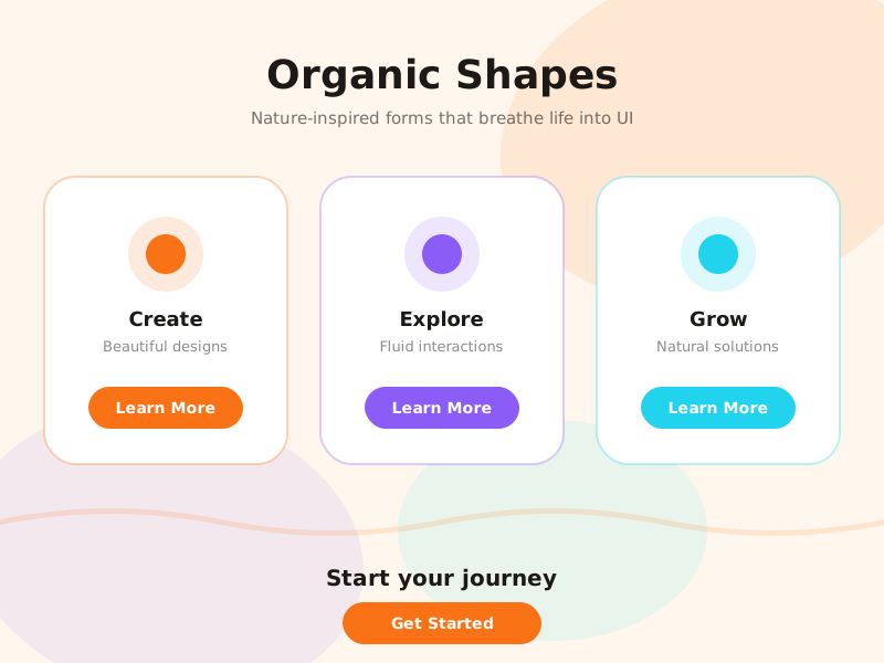
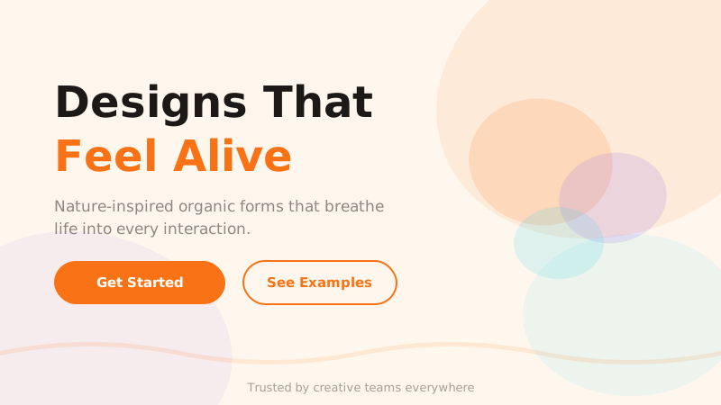
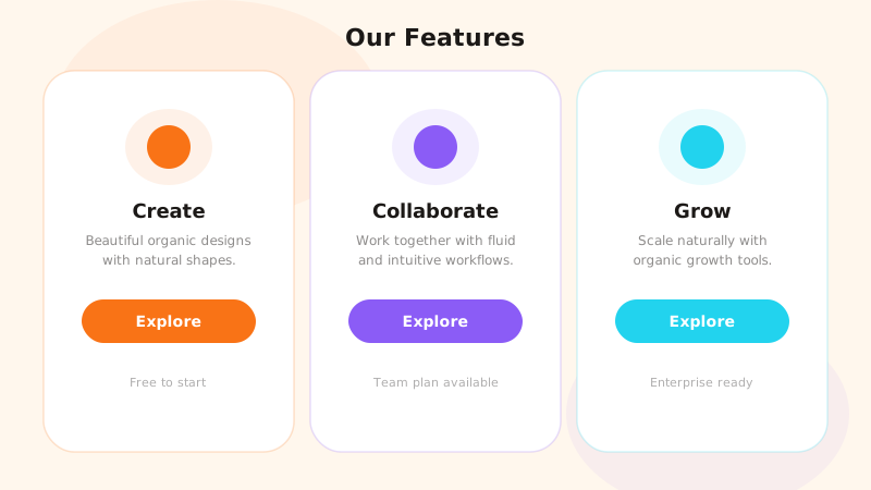
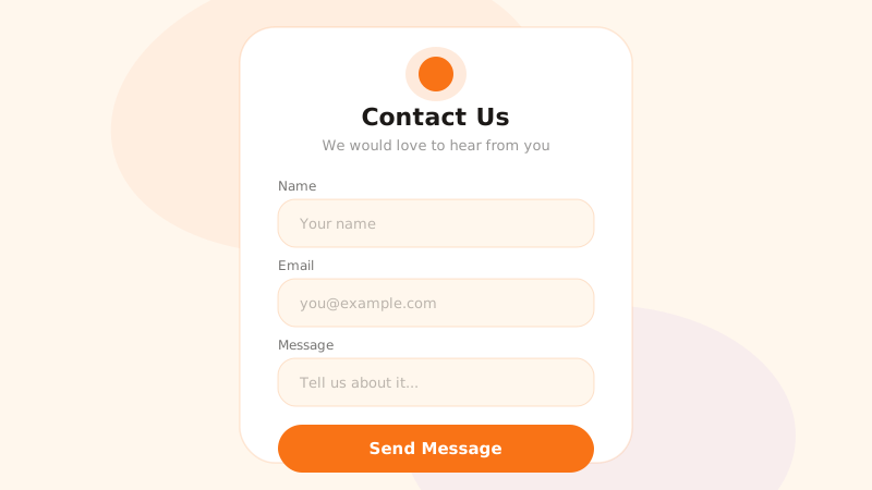
Try the sample controls. daisyUI uses compiled library classes; shadcn/ui uses React components from the New York registry. The three example layouts demonstrate styling with the selected tokens. All content is demo data.
Examples
Color Palette
Typography
Key Characteristics
- Blob and organic background shapes
- Soft rounded corners on all elements
- Flowing curves instead of sharp angles
- Natural warm color palette
- Asymmetric layouts with visual balance
- Hand-drawn or sketch-style accents
Tags
Organic shapes design rejects the rigid rectangles and straight lines that dominate most interfaces, replacing them with blobs, waves, and freeform curves drawn from nature. The movement grew alongside a broader cultural desire for warmth and humanity in digital products — if flat design felt cold and mechanical, organic shapes feel alive, approachable, and friendly. The trend took hold around 2021 as SVG blob generators and CSS clip-path made these shapes easy to implement.
When to Use
This style suits children’s products, wellness and health apps, food and recipe platforms, creative agencies, and any brand with a friendly, approachable personality. It works well for landing pages and marketing sites where emotional connection matters. Avoid it for highly technical or data-intensive dashboards where the freeform shapes may compete with structured content.
Key Visual Elements
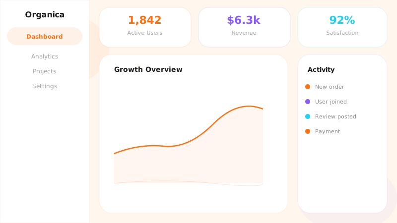
Large blob shapes in soft, warm colors serve as background decorations — they break up the page into organic zones without hard dividers. Cards and containers use generous border-radius values (16-24px or higher). Wavy section dividers replace horizontal rules. Illustrations lean toward a hand-drawn or sketched quality. The color palette draws from nature: warm oranges, earthy purples, and sky blues. Asymmetry is embraced, but visual weight remains balanced through careful composition.
Typography
DM Sans works across both headings and body, providing a clean geometric base that contrasts pleasantly with the organic shapes surrounding it. The typeface’s slightly rounded terminals echo the soft curves of the design language. Use bold weights for headings and regular for body text. Keep line heights generous to match the airy, relaxed mood of the overall aesthetic.
Export style
Choose a library mapping or use the CSS variables in your own components. JSON includes the same mapping. Load the listed fonts separately.
:root {
  --tx-surface-bg: #FFF7ED;
  --tx-font-heading: "DM Sans", sans-serif;
  --tx-font-body: "DM Sans", sans-serif;
  --tx-surface-bg-image: none;
  --tx-card-bg: #FFFFFF;
  --tx-card-border: rgba(249,115,22,0.15);
  --tx-card-border-width: 1px;
  --tx-card-radius: 2rem;
  --tx-card-shadow: 0 4px 16px rgba(249,115,22,0.06);
  --tx-card-backdrop-blur: 0px;
  --tx-card-border-hover: rgba(249,115,22,0.3);
  --tx-card-shadow-hover: 0 8px 24px rgba(249,115,22,0.1);
  --tx-font-heading-weight: 700;
  --tx-font-body-weight: 400;
  --tx-text-muted: rgba(28,25,23,0.6);
  --tx-text-subtle: rgba(28,25,23,0.4);
  --tx-link-color: #F97316;
  --tx-button-radius: 9999px;
  --tx-input-bg: #FFFFFF;
  --tx-input-border: rgba(249,115,22,0.2);
  --tx-text: #1C1917;
  --tx-primary: #F97316;
  --tx-secondary: #8B5CF6;
  --tx-accent: #22D3EE;
  --tx-media-filter: none;
}
Prompt Builder
Choose your project, UI library, and output. Prompts, documents, and exports use the same resolved theme values.
Use your own components with the exported CSS variables.
Organic Shapes
Live component preview
Try the sample controls. daisyUI uses compiled library classes; shadcn/ui uses React components from the New York registry. The three example layouts demonstrate styling with the selected tokens. All content is demo data.
Copy this prompt into your coding assistant. The task mode applies to the UI prompt.
Generated prompt
You are building a web application using Next.js with Tailwind.
Read existing project instructions and reuse installed components where available.

## Project
Project brief: Not specified
Target users: Not specified
Page purpose: Education
Framework: Next.js
CSS approach: Tailwind
UI library: Custom / no library
Tone: Professional

## Visual direction
Base theme: Organic Shapes (visual-style)
- Blob and organic background shapes
- Soft rounded corners on all elements
- Flowing curves instead of sharp angles
- Natural warm color palette
- Asymmetric layouts with visual balance
- Hand-drawn or sketch-style accents

## Resolved style
Use this final token set. It already includes the selected layers. These values take precedence over conflicting base characteristics.
Color palette: primary #F97316, secondary #8B5CF6, accent #22D3EE, background #FFF7ED, text #1C1917
Typography: DM Sans for headings, DM Sans for body text
Load the declared fonts with the required weights. Use system fallbacks when a font is unavailable.
```css
:root {
  --tx-surface-bg: #FFF7ED;
  --tx-font-heading: "DM Sans", sans-serif;
  --tx-font-body: "DM Sans", sans-serif;
  --tx-surface-bg-image: none;
  --tx-card-bg: #FFFFFF;
  --tx-card-border: rgba(249,115,22,0.15);
  --tx-card-border-width: 1px;
  --tx-card-radius: 2rem;
  --tx-card-shadow: 0 4px 16px rgba(249,115,22,0.06);
  --tx-card-backdrop-blur: 0px;
  --tx-card-border-hover: rgba(249,115,22,0.3);
  --tx-card-shadow-hover: 0 8px 24px rgba(249,115,22,0.1);
  --tx-font-heading-weight: 700;
  --tx-font-body-weight: 400;
  --tx-text-muted: rgba(28,25,23,0.6);
  --tx-text-subtle: rgba(28,25,23,0.4);
  --tx-link-color: #F97316;
  --tx-button-radius: 9999px;
  --tx-input-bg: #FFFFFF;
  --tx-input-border: rgba(249,115,22,0.2);
  --tx-text: #1C1917;
  --tx-primary: #F97316;
  --tx-secondary: #8B5CF6;
  --tx-accent: #22D3EE;
  --tx-media-filter: none;
}
```
Use the CSS variables in your own components. Apply the heading and body font variables to their respective elements.

## Layout
- Use curved decoration around content while keeping forms and text aligned.

## Interaction
- Keep shape motion decorative and avoid moving interactive targets.

## Suitability notes
Use these limitations to assess the chosen page purpose. Explain any mismatch before applying an unsuitable treatment.
- Organic Shapes: Dense grid-based workflows that need compact alignment.

## Components
Generate the following components in this style:
- Navbar
- Footer

## Quality requirements
Choose section order and visual emphasis from the real content and page purpose. Add only sections needed for the task.
Use supplied content. Label sample data. Do not invent testimonials, customer logos, statistics, or compliance claims.
Every interactive control must perform its declared action or be clearly labeled as a demo.
Include loading, empty, error, success, disabled, and focus states where applicable.
Use semantic HTML, visible keyboard focus, readable text contrast, and labeled form fields.
Ensure responsive design (mobile-first). Preserve reading order and avoid horizontal page overflow.
Respect prefers-reduced-motion. Keep essential content visible when animations are disabled.

## Verification
Check representative desktop and mobile widths, keyboard interaction, and relevant component states. Run available project checks and report what was actually verified.
Use Tailwind utility classes with the declared tokens.
Product context is incomplete. Label assumptions and treat the result as a draft until the missing context is supplied.