Retro/Y2K
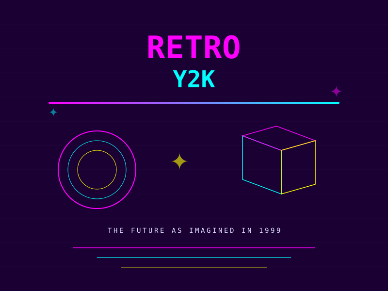
bold Visual styleThe future as imagined in 1999
Reference year: 2025
Compare this themeBest for
Games & entertainment, Brand & events, Portfolio
Less suitable for
- Formal workflows and long reading pages that need quiet typography.
Live component preview
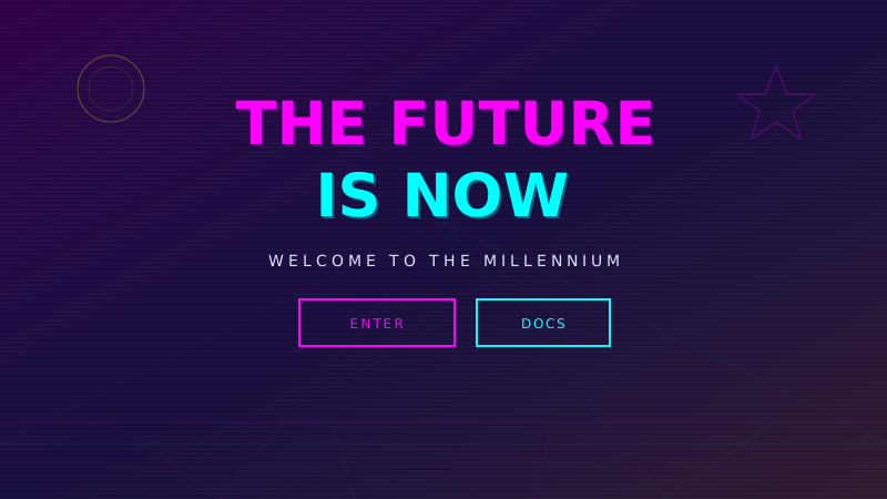
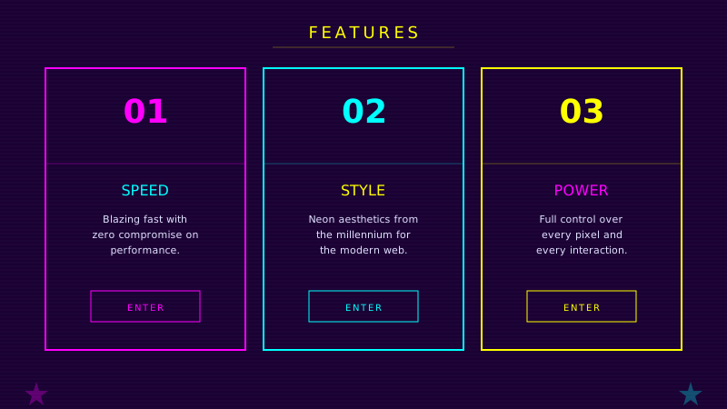
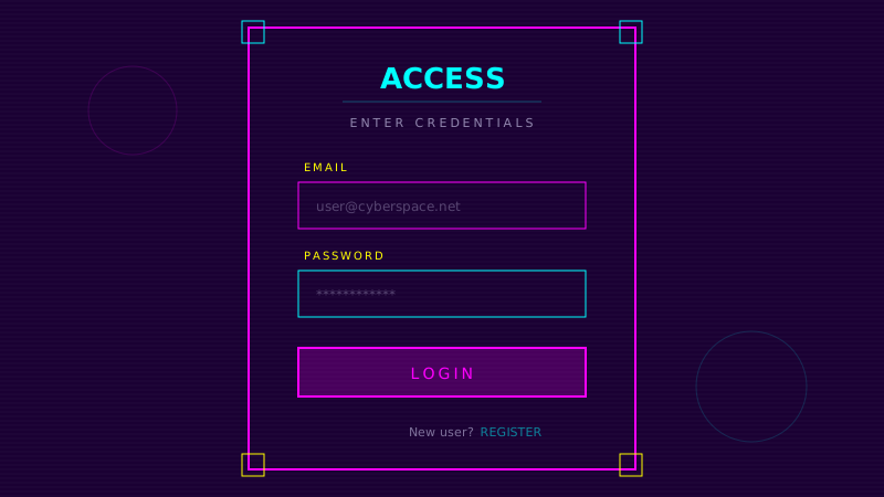
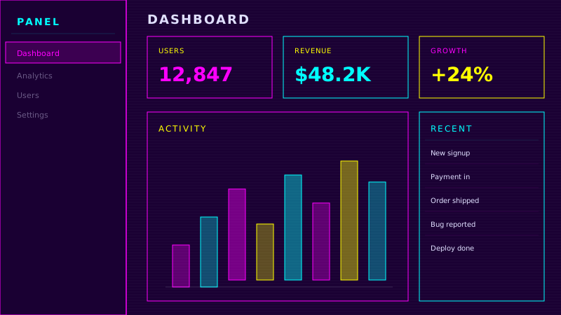
Try the sample controls. daisyUI uses compiled library classes; shadcn/ui uses React components from the New York registry. The three example layouts demonstrate styling with the selected tokens. All content is demo data.
Examples
Color Palette
Typography
Key Characteristics
- Metallic chrome effects and gradients
- Bright neon colors on dark backgrounds
- Pixel art and bitmap aesthetics
- Futuristic geometric shapes
- Glitch and scanline effects
- Millennium-era tech optimism
Tags
Retro/Y2K design is a love letter to the turn of the millennium — a time when the internet was new, the future felt limitless, and design embraced that optimism with chrome gradients, neon colors, and unapologetically futuristic aesthetics. This style channels the visual language of early web design, CD-ROM interfaces, and sci-fi movie UIs, but reinterprets them with modern techniques and an affectionate sense of nostalgia.
When to Use
Y2K aesthetics are perfect for music and entertainment sites, gaming platforms, retro-themed events and campaigns, streetwear and fashion brands targeting Gen Z, and creative portfolios that want to signal awareness of design history. It is particularly effective for limited-time campaigns, festival websites, and any context where you want to evoke a specific era while demonstrating technical skill. The style pairs well with vaporwave and synthwave cultural aesthetics.
Key Visual Elements
Neon colors — magenta, cyan, and yellow — glow against deep dark purple or black backgrounds. Chrome and metallic gradients simulate the reflective surfaces that defined Y2K graphic design. Geometric shapes (circles, stars, wireframe 3D objects) float and rotate. Scanline effects and glitch artifacts add texture and authenticity. Pixel art elements nod to the low-resolution origins of the era. Transparency and overlay blend modes create depth and visual complexity.
Typography
Orbitron captures the space-age futurism that defined millennium-era design, with its geometric letterforms suggesting digital displays and spacecraft instruments. Space Mono provides a terminal-like aesthetic for body text that reinforces the tech-forward personality. Both typefaces should be used with generous letter-spacing and may incorporate color effects — gradient text, glow effects, or animated color shifts.
Export style
Choose a library mapping or use the CSS variables in your own components. JSON includes the same mapping. Load the listed fonts separately.
:root {
  --tx-surface-bg: #1A0033;
  --tx-font-heading: "Orbitron", sans-serif;
  --tx-font-body: "Space Mono", sans-serif;
  --tx-surface-bg-image: radial-gradient(ellipse 80% 50% at 50% 50%, rgba(255,0,255,0.1), transparent);
  --tx-card-bg: rgba(255,0,255,0.05);
  --tx-card-border: rgba(255,0,255,0.3);
  --tx-card-border-width: 2px;
  --tx-card-radius: 0;
  --tx-card-shadow: 0 0 12px rgba(255,0,255,0.2);
  --tx-card-backdrop-blur: 0px;
  --tx-card-border-hover: rgba(0,255,255,0.5);
  --tx-card-shadow-hover: 0 0 24px rgba(0,255,255,0.3);
  --tx-font-heading-weight: 700;
  --tx-font-body-weight: 400;
  --tx-text-muted: rgba(224,224,255,0.7);
  --tx-text-subtle: rgba(224,224,255,0.5);
  --tx-link-color: #FF00FF;
  --tx-button-radius: 0;
  --tx-input-bg: rgba(255,0,255,0.05);
  --tx-input-border: rgba(255,0,255,0.3);
  --tx-text: #E0E0FF;
  --tx-primary: #FF00FF;
  --tx-secondary: #00FFFF;
  --tx-accent: #FFFF00;
  --tx-media-filter: none;
}
Prompt Builder
Choose your project, UI library, and output. Prompts, documents, and exports use the same resolved theme values.
Use your own components with the exported CSS variables.
Retro/Y2K
Live component preview
Try the sample controls. daisyUI uses compiled library classes; shadcn/ui uses React components from the New York registry. The three example layouts demonstrate styling with the selected tokens. All content is demo data.
Copy this prompt into your coding assistant. The task mode applies to the UI prompt.
Generated prompt
You are building a web application using Next.js with Tailwind.
Read existing project instructions and reuse installed components where available.

## Project
Project brief: Not specified
Target users: Not specified
Page purpose: Games & entertainment
Framework: Next.js
CSS approach: Tailwind
UI library: Custom / no library
Tone: Professional

## Visual direction
Base theme: Retro/Y2K (visual-style)
- Metallic chrome effects and gradients
- Bright neon colors on dark backgrounds
- Pixel art and bitmap aesthetics
- Futuristic geometric shapes
- Glitch and scanline effects
- Millennium-era tech optimism

## Resolved style
Use this final token set. It already includes the selected layers. These values take precedence over conflicting base characteristics.
Color palette: primary #FF00FF, secondary #00FFFF, accent #FFFF00, background #1A0033, text #E0E0FF
Typography: Orbitron for headings, Space Mono for body text
Load the declared fonts with the required weights. Use system fallbacks when a font is unavailable.
```css
:root {
  --tx-surface-bg: #1A0033;
  --tx-font-heading: "Orbitron", sans-serif;
  --tx-font-body: "Space Mono", sans-serif;
  --tx-surface-bg-image: radial-gradient(ellipse 80% 50% at 50% 50%, rgba(255,0,255,0.1), transparent);
  --tx-card-bg: rgba(255,0,255,0.05);
  --tx-card-border: rgba(255,0,255,0.3);
  --tx-card-border-width: 2px;
  --tx-card-radius: 0;
  --tx-card-shadow: 0 0 12px rgba(255,0,255,0.2);
  --tx-card-backdrop-blur: 0px;
  --tx-card-border-hover: rgba(0,255,255,0.5);
  --tx-card-shadow-hover: 0 0 24px rgba(0,255,255,0.3);
  --tx-font-heading-weight: 700;
  --tx-font-body-weight: 400;
  --tx-text-muted: rgba(224,224,255,0.7);
  --tx-text-subtle: rgba(224,224,255,0.5);
  --tx-link-color: #FF00FF;
  --tx-button-radius: 0;
  --tx-input-bg: rgba(255,0,255,0.05);
  --tx-input-border: rgba(255,0,255,0.3);
  --tx-text: #E0E0FF;
  --tx-primary: #FF00FF;
  --tx-secondary: #00FFFF;
  --tx-accent: #FFFF00;
  --tx-media-filter: none;
}
```
Use the CSS variables in your own components. Apply the heading and body font variables to their respective elements.

## Layout
- Use bold headings, metallic accents, and a structured layout behind retro decoration.

## Interaction
- Use short decorative transitions. Avoid blinking text and flashing effects.

## Suitability notes
Use these limitations to assess the chosen page purpose. Explain any mismatch before applying an unsuitable treatment.
- Retro/Y2K: Formal workflows and long reading pages that need quiet typography.

## Components
Generate the following components in this style:
- Hero
- Navbar
- Cards
- Footer

## Quality requirements
Choose section order and visual emphasis from the real content and page purpose. Add only sections needed for the task.
Use supplied content. Label sample data. Do not invent testimonials, customer logos, statistics, or compliance claims.
Every interactive control must perform its declared action or be clearly labeled as a demo.
Include loading, empty, error, success, disabled, and focus states where applicable.
Use semantic HTML, visible keyboard focus, readable text contrast, and labeled form fields.
Ensure responsive design (mobile-first). Preserve reading order and avoid horizontal page overflow.
Respect prefers-reduced-motion. Keep essential content visible when animations are disabled.

## Verification
Check representative desktop and mobile widths, keyboard interaction, and relevant component states. Run available project checks and report what was actually verified.
Use Tailwind utility classes with the declared tokens.
Product context is incomplete. Label assumptions and treat the result as a draft until the missing context is supplied.