Skeuomorphism Revival
playful Visual styleRealistic textures making a comeback
Reference year: 2023
Compare this themeBest for
Games & entertainment, Education, Portfolio
Less suitable for
- Large administrative interfaces where realistic decoration obscures controls.
Live component preview
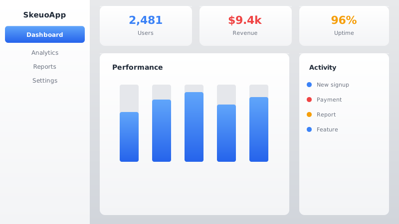
Try the sample controls. daisyUI uses compiled library classes; shadcn/ui uses React components from the New York registry. The three example layouts demonstrate styling with the selected tokens. All content is demo data.
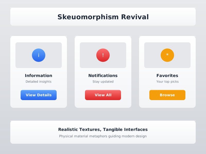
Examples
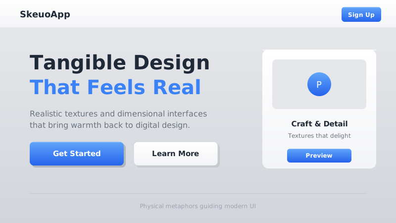
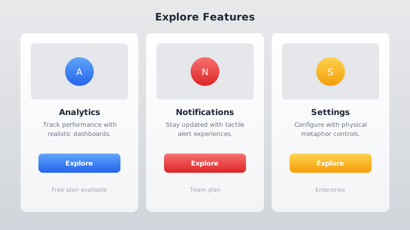
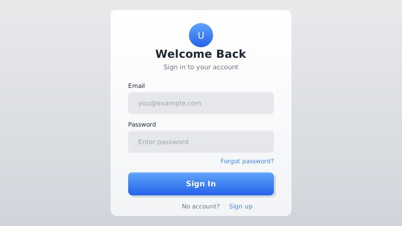
Color Palette
Typography
Key Characteristics
- Realistic textures imitating leather, metal, and wood
- Dimensional buttons with highlight and shadow edges
- Subtle gradients mimicking real-world materials
- Drop shadows providing depth and realism
- Detailed iconography rendered with depth and shading
- Physical material metaphors guiding UI element design
Tags
Skeuomorphism — the practice of making digital interfaces resemble real-world objects — dominated early iOS and web design before flat design swept it aside around 2013. A decade later, it is making a selective comeback. The revival does not replicate the heavy-handed leather stitching of iOS 6, but instead applies tasteful textures, subtle gradients, and dimensional lighting to create interfaces that feel tangible and grounded. Nostalgia, combined with fatigue from years of ultra-flat sameness, drives the renewed interest.
When to Use
Skeuomorphism revival works well for productivity tools, note-taking apps, music and audio interfaces, game UIs, and any product targeting users who appreciate craft and tactile quality. It can also add warmth and familiarity to onboarding flows and educational software. Use it when you want users to immediately understand how an element works because it looks like something they already know from the physical world.
Key Visual Elements
Buttons feature subtle top-to-bottom gradients with a light highlight at the top edge and a darker shadow at the bottom, simulating overhead lighting. Cards and panels use light inner shadows to create a recessed or raised appearance. Background textures — fine linen, subtle paper grain, brushed metal — add richness without overwhelming content. Icons have dimensionality: gentle gradients, small shadows, and occasional reflections. The color palette is grounded and warm, avoiding the neon intensity of flat design accents.
Typography
Merriweather provides a serif heading style that reinforces the traditional, crafted feeling — its sturdy letterforms echo the reliability of physical objects. Source Sans 3 offers clean, highly legible body text that balances the visual richness of the surrounding textures. The contrast between serif headings and sans-serif body mirrors the classic print design pairing, further grounding the design in familiar conventions.
Export style
Choose a library mapping or use the CSS variables in your own components. JSON includes the same mapping. Load the listed fonts separately.
:root {
  --tx-surface-bg: #F3F4F6;
  --tx-font-heading: "Merriweather", sans-serif;
  --tx-font-body: "Source Sans 3", sans-serif;
  --tx-surface-bg-image: linear-gradient(180deg, #F9FAFB 0%, #F3F4F6 100%);
  --tx-card-bg: #FFFFFF;
  --tx-card-border: rgba(0,0,0,0.1);
  --tx-card-border-width: 1px;
  --tx-card-radius: 0.75rem;
  --tx-card-shadow: 0 2px 8px rgba(0,0,0,0.08), inset 0 1px 0 rgba(255,255,255,0.9);
  --tx-card-backdrop-blur: 0px;
  --tx-card-border-hover: rgba(0,0,0,0.15);
  --tx-card-shadow-hover: 0 4px 12px rgba(0,0,0,0.12), inset 0 1px 0 rgba(255,255,255,0.9);
  --tx-font-heading-weight: 700;
  --tx-font-body-weight: 400;
  --tx-text-muted: rgba(31,41,55,0.7);
  --tx-text-subtle: rgba(31,41,55,0.5);
  --tx-link-color: #3B82F6;
  --tx-button-radius: 0.5rem;
  --tx-input-bg: #FFFFFF;
  --tx-input-border: rgba(0,0,0,0.15);
  --tx-text: #1F2937;
  --tx-primary: #3B82F6;
  --tx-secondary: #EF4444;
  --tx-accent: #F59E0B;
  --tx-media-filter: none;
}
Prompt Builder
Choose your project, UI library, and output. Prompts, documents, and exports use the same resolved theme values.
Use your own components with the exported CSS variables.
Skeuomorphism Revival
Live component preview
Try the sample controls. daisyUI uses compiled library classes; shadcn/ui uses React components from the New York registry. The three example layouts demonstrate styling with the selected tokens. All content is demo data.
Copy this prompt into your coding assistant. The task mode applies to the UI prompt.
Generated prompt
You are building a web application using Next.js with Tailwind.
Read existing project instructions and reuse installed components where available.

## Project
Project brief: Not specified
Target users: Not specified
Page purpose: Games & entertainment
Framework: Next.js
CSS approach: Tailwind
UI library: Custom / no library
Tone: Professional

## Visual direction
Base theme: Skeuomorphism Revival (visual-style)
- Realistic textures imitating leather, metal, and wood
- Dimensional buttons with highlight and shadow edges
- Subtle gradients mimicking real-world materials
- Drop shadows providing depth and realism
- Detailed iconography rendered with depth and shading
- Physical material metaphors guiding UI element design

## Resolved style
Use this final token set. It already includes the selected layers. These values take precedence over conflicting base characteristics.
Color palette: primary #3B82F6, secondary #EF4444, accent #F59E0B, background #F3F4F6, text #1F2937
Typography: Merriweather for headings, Source Sans 3 for body text
Load the declared fonts with the required weights. Use system fallbacks when a font is unavailable.
```css
:root {
  --tx-surface-bg: #F3F4F6;
  --tx-font-heading: "Merriweather", sans-serif;
  --tx-font-body: "Source Sans 3", sans-serif;
  --tx-surface-bg-image: linear-gradient(180deg, #F9FAFB 0%, #F3F4F6 100%);
  --tx-card-bg: #FFFFFF;
  --tx-card-border: rgba(0,0,0,0.1);
  --tx-card-border-width: 1px;
  --tx-card-radius: 0.75rem;
  --tx-card-shadow: 0 2px 8px rgba(0,0,0,0.08), inset 0 1px 0 rgba(255,255,255,0.9);
  --tx-card-backdrop-blur: 0px;
  --tx-card-border-hover: rgba(0,0,0,0.15);
  --tx-card-shadow-hover: 0 4px 12px rgba(0,0,0,0.12), inset 0 1px 0 rgba(255,255,255,0.9);
  --tx-font-heading-weight: 700;
  --tx-font-body-weight: 400;
  --tx-text-muted: rgba(31,41,55,0.7);
  --tx-text-subtle: rgba(31,41,55,0.5);
  --tx-link-color: #3B82F6;
  --tx-button-radius: 0.5rem;
  --tx-input-bg: #FFFFFF;
  --tx-input-border: rgba(0,0,0,0.15);
  --tx-text: #1F2937;
  --tx-primary: #3B82F6;
  --tx-secondary: #EF4444;
  --tx-accent: #F59E0B;
  --tx-media-filter: none;
}
```
Use the CSS variables in your own components. Apply the heading and body font variables to their respective elements.

## Layout
- Use familiar physical forms sparingly while keeping labels and navigation explicit.

## Interaction
- Show pressed states clearly and keep simulated physical motion short.

## Suitability notes
Use these limitations to assess the chosen page purpose. Explain any mismatch before applying an unsuitable treatment.
- Skeuomorphism Revival: Large administrative interfaces where realistic decoration obscures controls.

## Components
Generate the following components in this style:
- Hero
- Navbar
- Cards
- Footer

## Quality requirements
Choose section order and visual emphasis from the real content and page purpose. Add only sections needed for the task.
Use supplied content. Label sample data. Do not invent testimonials, customer logos, statistics, or compliance claims.
Every interactive control must perform its declared action or be clearly labeled as a demo.
Include loading, empty, error, success, disabled, and focus states where applicable.
Use semantic HTML, visible keyboard focus, readable text contrast, and labeled form fields.
Ensure responsive design (mobile-first). Preserve reading order and avoid horizontal page overflow.
Respect prefers-reduced-motion. Keep essential content visible when animations are disabled.

## Verification
Check representative desktop and mobile widths, keyboard interaction, and relevant component states. Run available project checks and report what was actually verified.
Use Tailwind utility classes with the declared tokens.
Product context is incomplete. Label assumptions and treat the result as a draft until the missing context is supplied.